Introduction
styled-components is a CSS-in-JS solution which adds various features to improve the developer experience (DX).
What is a styled-component?
A styled-component is an element which already has styling applied to it, hence the name styled component.
We then use the component as we would a normal component.
In the example below, we’ve created a styled-component called Button, which we then use in our App.js file:
import React from 'react';
import styled from 'styled-components';

const Button = styled.button`
  border: 0;
  background: none;
  background-color: lightcoral;
`;

function App() {
  return <Button>Hello</Button>;
}

export default App;
SASS
styled-components come with SASS out of the box, allowing you to immediately write SASS in your styled-components.
How to install
npm
npm install --save styled-components@5.3.10
yarn
yarn add styled-components@5.3.10
How to create a styled-component
To create a styled-component, we import styled from styled-components.
We then use this styled interface to create our element by adding a fullstop . after the styled interface, following with the element we want to create.
In the example above, we are using the button element.
const Button = styled.button``;
We can create any kind of HTML element. In the example below, we are creating a div called Container:
const Container = styled.div``;
Passing props into a component
One of the best features in styled-components is that we can pass props into a styled-component and then modify our styling based on the prop we passed into our styled component.
Each of our styled-components has a props object that is available if we add a callback function within the string literal syntax ${}. In the example styled-component below, we access an isActive prop within our styled-component.
const Item = styled.li`
  background-color: ${(props) => (props.isActive ? 'red' : '')};
`;
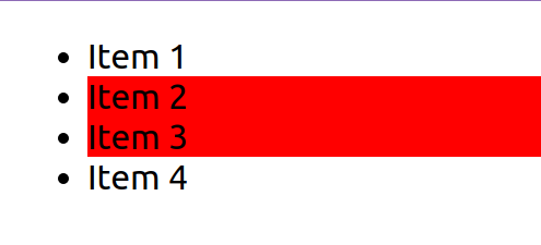
We will now extend the above example so that the isActive prop gets passed to the Item styled-component. In the following example, we are going to change the styling of our <li> styled-component by passing in an isActive prop. We will add this isActive prop to the 2nd and 3rd items in our list:
NOTE: Take note how in the 3rd
<Item>component,Item 3, we are adding={true}because this is already implicitly (automatically) added.
import React from 'react';
import styled from 'styled-components';

const Item = styled.li`
  background-color: ${(props) => (props.isActive ? 'red' : '')};
`;

function App() {
  return (
    <ul>
      <Item>Item 1</Item>
      <Item isActive={true}>Item 2</Item>
      <Item isActive>Item 3</Item>
      <Item>Item 4</Item>
    </ul>
  );
}

export default App;
Extending a style
We can reuse the styling in a styled-component component as the base styling and then add to it. This is referred to as extending a style.
In the example below, we have a baseline button and style it according to how we want it in our app.
We then extend the styling into a new styled-component called <PrimaryButton>.
Note how we used styled(BaseButton), adding in our BaseButton styled-component, instead of the normal syntax of styled.button.
Any button we extend from BaseButton will include all of its CSS, so you only need to set your base styling once, such as border radius and animations. This keeps your code clean (DRY), as you only need to make changes in one place.
import React from 'react';
import styled from 'styled-components';

const BaseButton = styled.button`
  background-color: white;
  border: 2px solid black;
  border-radius: 6px;
  padding: 10px 20px;
  cursor: pointer;
  transition: background-color linear 800ms;

  :hover {
    background-color: black;
    color: white;
  }
`;

const PrimaryButton = styled(BaseButton)`
  background-color: red;
`;

function App() {
  return (
    <div>
      <BaseButton>Base button</BaseButton>
      <PrimaryButton>Base button</PrimaryButton>
    </div>
  );
}

export default App;
Video: Intro to styled-components
We look at styled-components and some examples in the following video:
Best practices with styled-components
Separating styled-components from React code
When using styled-components, you might want to consider having your styled-components in a separate file that is co-located, i.e. in the same directory as the main React file.
The file would then have the same name as the React file but with styles before the file extension, e.g. App.styles.js or index.styles.js
For example, your folder structure for a <MyExample> would look as follows:
MyExample folder:
/MyExample.js         <-- Your React file
/MyExample.styles.js  <-- Your styled-component file
This allows you to separate out your styling and keeps your file sizes smaller.
Importing as an alias
In addition to this, you could import all of your components as an alias, such as S, and then access all of your styled-components with dot notation.
In the example below, we have separated our styled-components into a separate file, App.styles.js. We then import all of these as an alias in our App.jsx file:
App.styles.js
import styled from 'styled-components';

export const Container = styled.div`
  display: flex;
  align-items: center;
`;

export const Heading = styled.h1`
  color: red;
`;
App.jsx
import React from 'react';
import * as S from './App.styles';

function App() {
  return (
    <div>
      <S.Container>
        <S.Heading>This is my heading</S.Heading>
      </S.Container>
    </div>
  );
}

export default App;
Theming with styled-components
We can add themes to our apps very easily with styled-components.
styled-components provides us with a <ThemeProvider> wrapper that takes an object we create, called a theme, that contains any CSS properties we would like. Our styled-components would then have access to these theme values.
In the example below, we create our theme object (theme) with nested properties.
We wrap all our code with the <ThemeProvider> and pass our theme object into this provider.
We then can access our theme values as part of the props callback in our styled-component.
import React from 'react';
import styled, { ThemeProvider } from 'styled-components';

// Our theme object
const theme = {
  color: {
    primary: 'blue',
    secondary: 'red',
  },
};

// In our styled-component we access the properties of our theme
const Button = styled.button`
  padding: 10px 20px;
  background: ${(props) => props.theme.color.primary};
  border-radius: 6px;
  border: 0;
  cursor: pointer;
`;

function App() {
  // We wrap our code with the ThemeProvider that has the theme
  // passed to it
  return (
    <ThemeProvider theme={theme}>
      <div>
        <Button>Click me</Button>
      </div>
    </ThemeProvider>
  );
}

export default App;
Video: Theming with styled-components
Lesson task
Goal
For the student to be able to use styled-components effectively.
Brief
You are going to apply a theme to an app, create a styled-component, use a theme value and then lastly, use props to change a styled-component.
NOTE: Lesson tasks do not get submitted on Moodle and are not assessed by tutors. They are mainly there for you to practise what you have learnt in the lesson.
Level 1 process
-
Create and implement a theme for your app. You only need to have one value in your theme, such as a primary color.
-
Create a
<button>styled-componentand call it in your app. -
Add the theme value you created to your
<button>styled-component. -
Create a boolean value and pass it to your
styled-component, then alter your styling of the<button>styled-componentbased on this boolean value passed as a prop.