Introduction
This lesson will look at the fundamental principles of UX design and how designers use them for a good user experience.
UX design principles
UX design is all about how users feel while interacting with your product. It is the process used to create experiences that are meaningful and relevant to the user. In this process, we centralise the role of the user and focus all design decisions around them.
Here are a few fundamental points to help you succeed when creating a user-centered experience:
Focus on user needs
It is important to understand who your users (customers/clients) are and what they need the product to do for them. We establish the users’ needs through user testing and research. Remember that you are not necessarily the user, and what you might find to be the best solution for yourself might not be the best solution for the user.
We need to centralise the user as the focal point for all our design decisions. Imagine having a new baby or pet in the house. Every decision and every move you make will be with them in mind, and the entire house will be rearranged to ensure the new member is comfortable and happy.
This is essentially what you need to focus on when it comes to the UX design of a website or app. Every decision should be based on the users’ need and how they will interact with the interface. Giving the user what they need will ensure a happy user who will most probably return to your website.
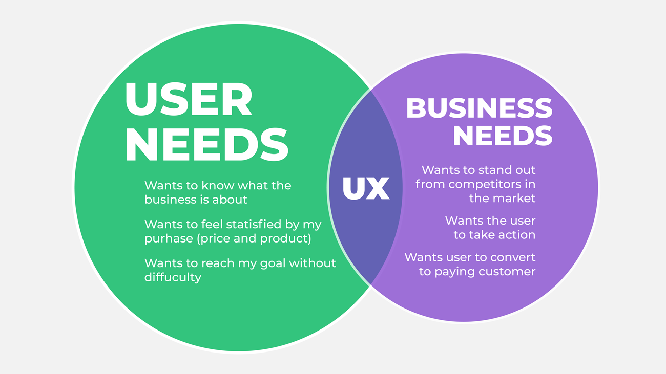
Figure 1: An example of user and business needs.
Information hierarchy
How a site’s content is organised dramatically impacts how the user interacts with a product. This includes the navigation (menus) and how the headings and content are grouped and laid out. The more logical and well-considered the content, the more user-friendly the product will be.
Information should be presented to the user according to importance. The most important piece of information comes first. Keep in mind that users scan through information and need to do so quickly and effortlessly.
The image below demonstrates a bad information hierarchy. The hamburger menu on the desktop is not intuitive and doesn’t tell the user what they can do on the website.
The article itself is hard to read. The header, subheader and body text are the same text size and not enticing enough for a user to want to know more about the news story. The ‘sign up’ should also be more prominent. The way it looks now, a user will scroll past it and not even notice it.
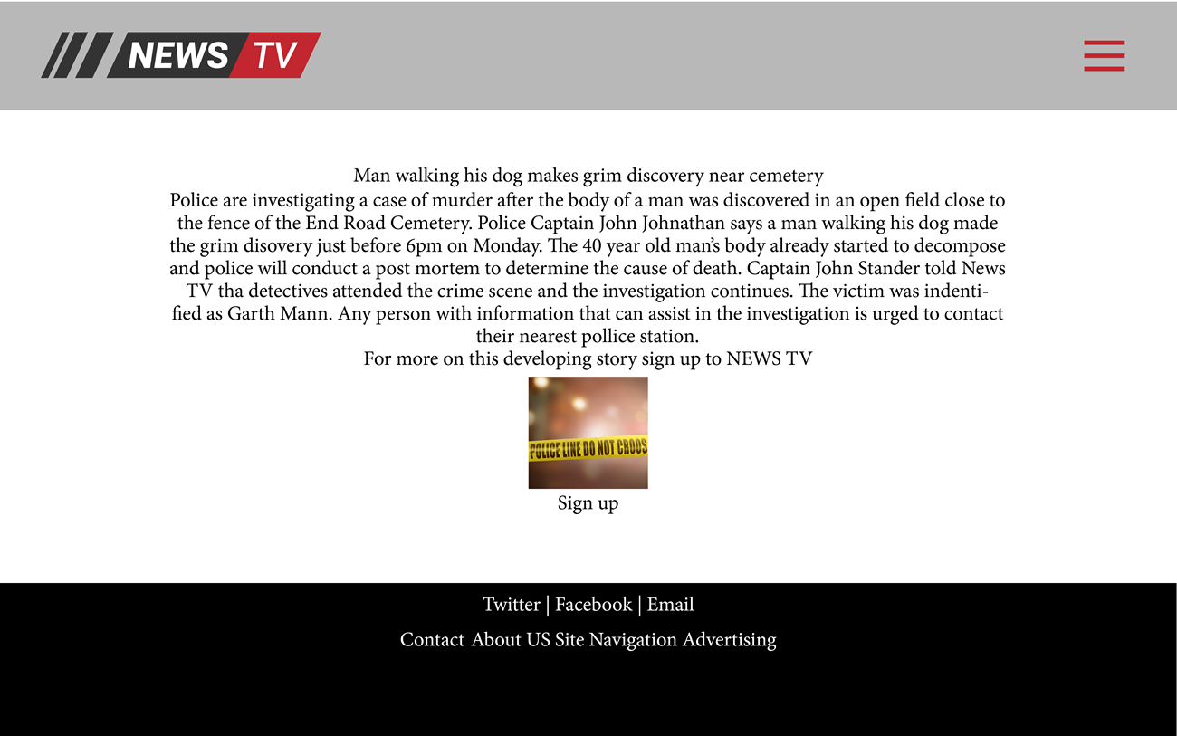
Figure 2: Poor information hierarchy.
The image below is the same website, but the designers paid more attention to the information hierarchy. The main header is big enough to attract attention to the title of the story, the subheader gives more information into what happened, and the body text explains in full detail what went down. Pay attention to how spacing and grouping are used on the page:
-
The main header is first, and below it is more information on the journalist and the article’s time and date. The main header and information are grouped together.
-
Then there is an open space.
-
We can see the main image underneath the open space with details about the image and the photographer’s name. The image and details below are also grouped together.
-
More open space.
-
The subheader is a bit smaller than the main header but still bigger than the body text.
-
More open space.
-
Then the user is presented with the rest of the news story.
-
More open space.
-
Then the sign up. The CTA button is prominent for users to see the action immediately.
The way information is presented in the design below will entice the user to read the article. Not only that, but the user will be able to scan through the story quickly, get the details and move on to the next headline.
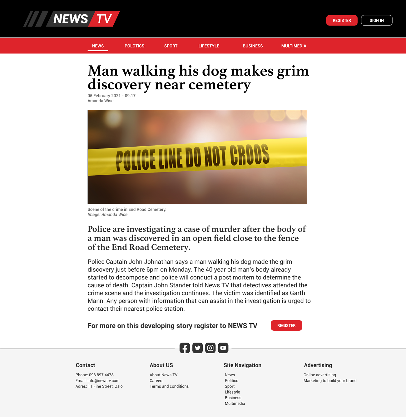
Figure 3: An example of good information hierarchy.
Consistency
Consistency helps users become familiar with your product quickly, making it easier for them to learn and use. If there is too much inconsistency with your product’s usability, users will get confused and demotivated. They might become discouraged to come back to your product.
Elements on a page need to look consistent and function similarly from one page to another. When you look at the example below, you can see CTAs are the same from one page to another. The icons are consistent in their placement, and the use of colour is also the same throughout.
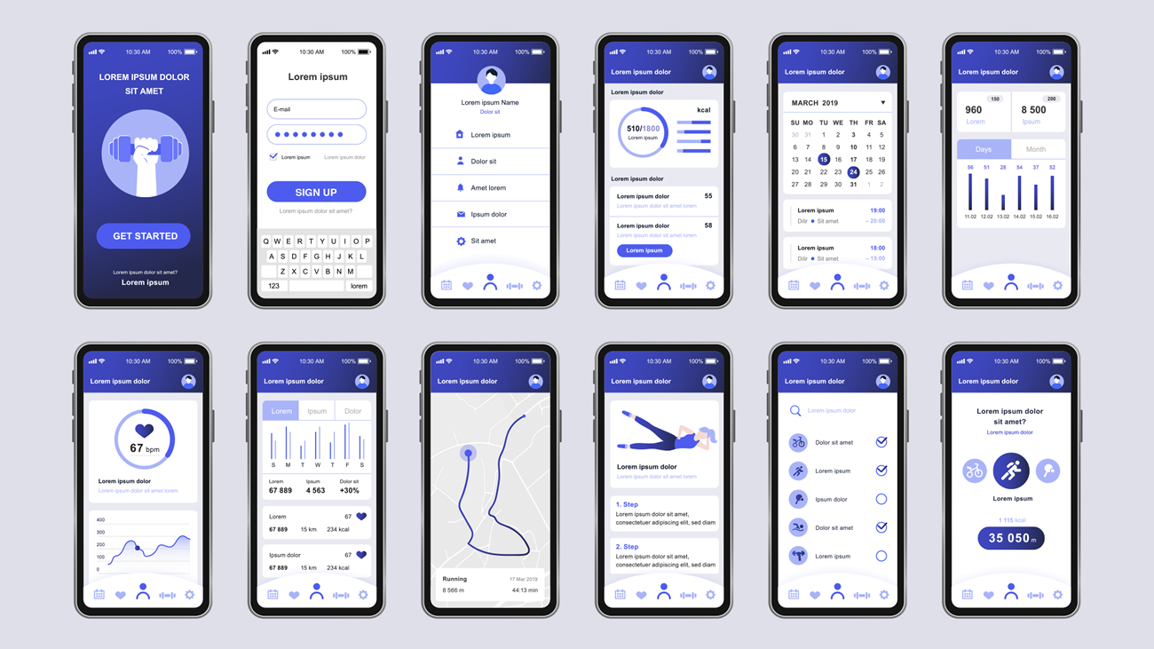
Figure 4: An example of good consistency on a fitness app.
Accessibility
The website or app should be accessible for all users. Designing with this in mind is vital. The design should be responsive on all screen sizes and cater to users with disabilities.
Ensuring there is a good contrast between background and text colour is one way to ensure accessibility. The text should not be too small and should be easy to read when a user accesses the website in a room with minimum light, for example.
The example below demonstrates bad colour contrast, which will make the message hard to read for users without disabilities, let alone those whose vision is impaired.

Figure 5: An example of an inaccessible web page.
The example below shows good colour contrast and is more accessible.
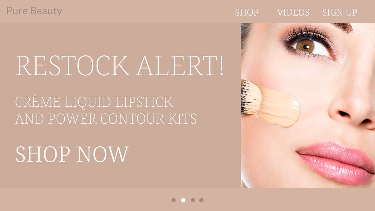
Figure 6: Good colour use ensures an accessible website
User feedback
The user should know where they are in the process of using your product: Where are they, how did they get there, and what should they do next? Confirming their actions with an animation, design change, or text prompt is an essential feature that keeps them engaged and informed.
The UX designer also needs to consider the context in which feedback is given to a user. This includes the physical context and emotional context. Like with any feedback in life, we need to know what needs to change where, and because feedback can sometimes come across as reprimanding, UX designers need to pay close attention to how it is conveyed.
Usually, when a user is given bad news, designers will do it with more empathy than congratulating them on purchasing a product or winning a weekend away for two. The physical context feedback should happen where it is visible on the page and where the user can clearly see it.
Think of when adding an item to your online cart. You’ll receive immediate feedback saying your item was successfully added, and you can then proceed to checkout.
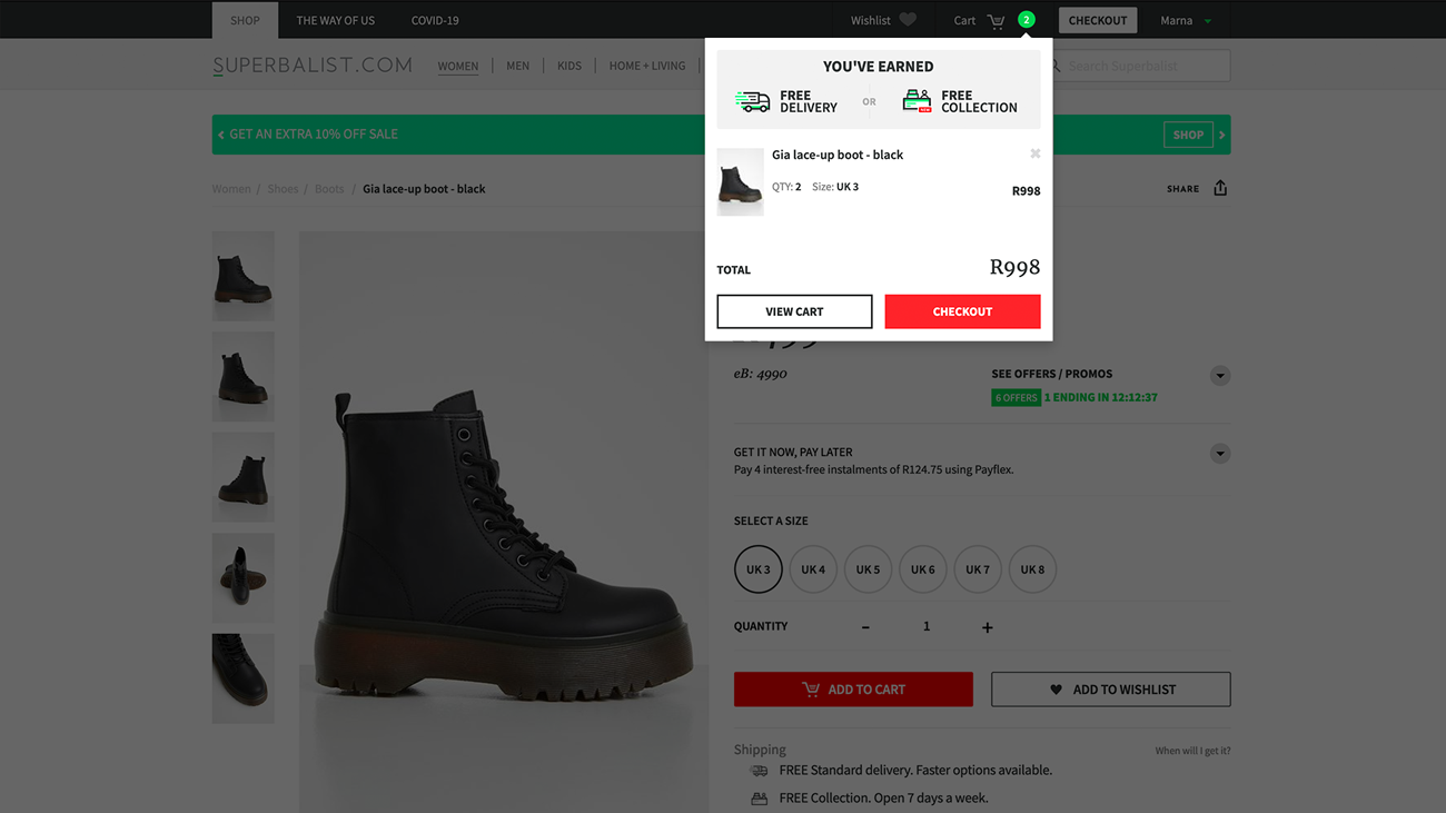
Figure 7: Good user feedback with the ‘add to cart’ process.
Simplicity
The Nielsen Norman Group summed up the definition of user experience design perfectly by saying that the first requirement for an excellent user experience is to meet the customer’s exact needs without fuss or bother. The next step is simplicity and elegance that produce products that are a pleasure to use (Nielsen Norman Group, 2016).
Clarity and simplicity ensure a good user experience. It leads the user on a smooth and uncluttered journey that avoids confusion. Overwhelming the user with too many options and/or complex solutions could make them give up the process. Keep all aspects of your product as simple, linear and straightforward as possible.
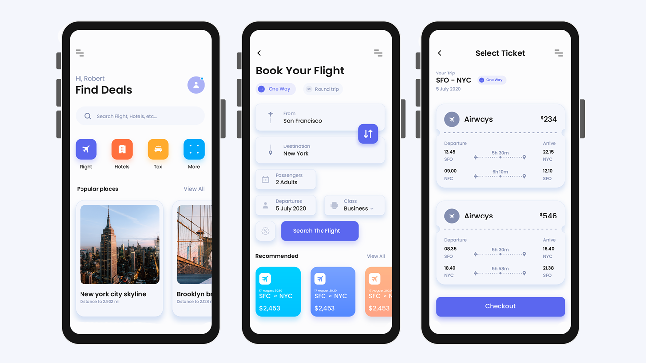
Figure 8: A simple, uncluttered flight booking app.
Activities
Activity 1
WATCH
Video: What the #$%@ is UX Design? (5m 30s)
Activity 2
WATCH
Video: What is the UX design process? (4m 02s)
Activity 3
WATCH
Video course: UX Design 2: Analysing User Data (30m)
Activity 4
READ
Case Study 1: Helping homeowners understand their home value on Zillow
Activity 5
READ
Case Study 2: Redesigning the New York Times app
Activity 6
READ
Case Study 2: Redesigning Airbnb for the new normal
Activity 7
READ
In the book, ‘Don’t Make Me Think’, read the following chapters.
- Chapter 8: The Farmer and the cowman should be friends
- Chapter 9: Usability testing on 10 cents a day
- Chapter 12: Accessibility and you
Lesson Task
Brief
Search for any website/app of your choice. Ask family and friends to interact with the chosen website/app and observe them. Ask questions like what they found confusing and what they found easy and enjoyable. With this knowledge, redesign the homepage of the chosen website/app.
Level 1 Process
- Conduct your research and make notes of the process.
- Based on your research, plan how you would make the journey more enjoyable for the user.
- In Figma, redesign the homepage of the website/app.