Introduction
Typography is when letters and text are arranged that makes information legible, clear and aesthetically pleasing. One needs to consider the role typography plays, and choose fonts for the headings and body content text that works well together.
In this lesson, we will:
-
take a look at pairing different fonts
-
see how to use custom web fonts for your design
-
take a look at the style tile where we will take everything discussed in the previous lessons and put it all together in one design deliverable.
NOTE: This lesson contains 2 activities that you should complete.
NOTE: The right choice for your typography on your website is essential. Not only from an aesthetic point of view (if it looks good and suits the genre of the site) but also from a functional and usable point of view (is it easy to read for users and clear enough). Aesthetics and usability need to work together to form the perfect fit for the brand and the target audience.
Headings
For headings, one can choose expressive, unique fonts to add personality to the website. These fonts should stand out to the user and be prominent on the page. There should be a distinction between the headings and the body text. Often, decorative fonts are used for headings, as they can be fun and artistic.
But before you go crazy with the decorative fonts, make sure they are:
-
Easy to read.
-
In-line with the corporate identity of the client.
-
Relevant to the target audience the client wants to reach.
Keep in mind that most online users scan through information. If a headline consists of a font that is too intricate and hard to read, the user may be confused and, in the end, waste time trying to figure out what the headline is communicating. It’s never a good idea to let the user think too long about information.
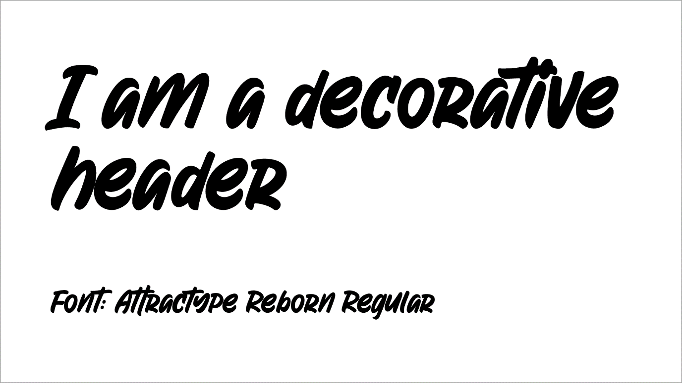
Figure 1. An example of a decorative font.
Serif fonts are usually used for headings as they have small lines on the letters giving the font character. They stand out more and are a good choice for headings. But again, it’s crucial to consider the brand. Would a serif font appeal to a company selling dirt bikes or would it be better suited to a bookstore? The bookstore would most likely be the best fit.

Figure 2. The serif font fits the genre of the brand better.
Body text
The content text for your website should be clean and legible with proper spacing between letters and lines. Sans serif fonts are the right choice as they are quite readable and simple fonts.
Cursive and handwriting fonts can be harder to read in more significant blocks of text. Reserve these fonts for specific areas or use them for only a select few words, such as for quotations.
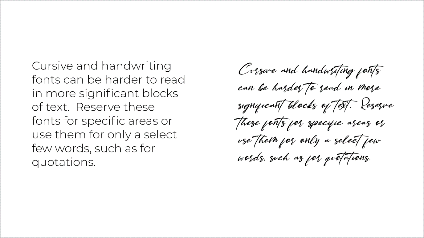
Figure 3. Cursive and handwriting fonts are harder to read.
Font pairings
Choose fonts that:
-
complement each other.
-
appeal to your target audience.
-
match the genre of the website.
Often sans serif fonts are used for the content text of the page, and serif fonts used for the headings. Contrast is useful, for example, if you are using a decorative font for headings, it would be good to use a simple sans serif font for the body text.
You can pair a subtle, simple typeface for the body text with a bold font for the headings. See more here
Using too many fonts on the website may confuse users and clutter the design. Using only two to three fonts is optimal, with a primary font for the headings, a secondary font for the main body text, and an accent font used in specific places on the web page, such as for calls to action and quotes.
Keep the hierarchy in mind
Hierarchy in typography is arranging the text in order of importance. The word hierarchy is fundamental in the world of design. It’s important because it helps to convey a sequence for the user visually. The user needs to know by looking at the design which text is more important and therefore, which text needs to be read first.
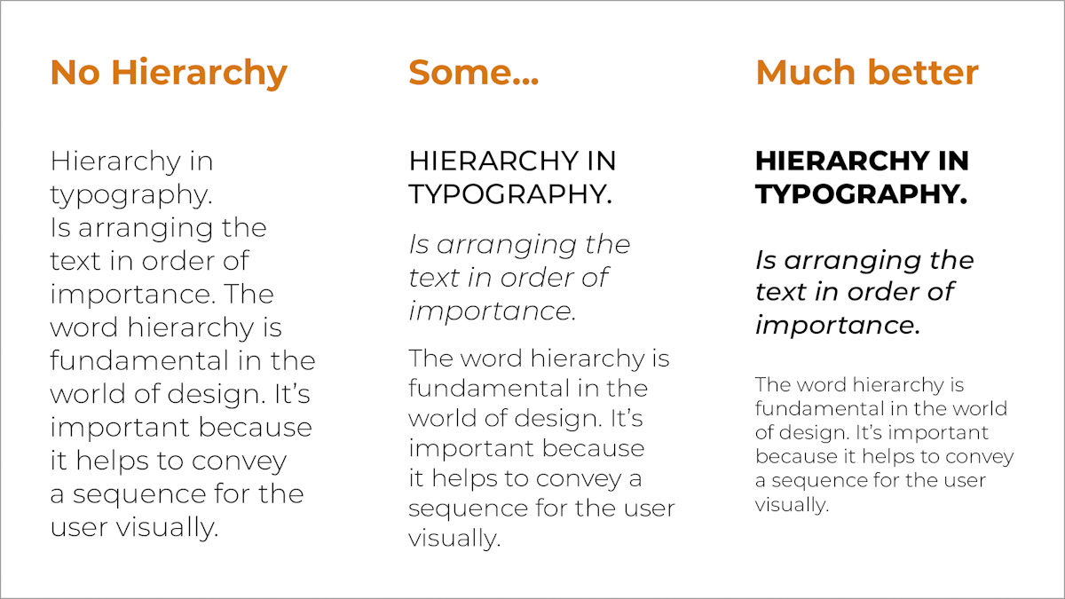
Figure 4. Hierarchy with typography.
Hierarchy can be achieved by enriching your typography in a few different ways:
Amount of typefaces
Too many typefaces used on a webpage can be confusing and have a cluttered effect. Keep to two or three fonts and have the roles consistent, e.g. the same font used throughout for headings helps the user read through the design quickly.
Font sizes
Contrast occurs when differentiating between the two typefaces for headings and body.
It can be achieved with:
-
The type of typefaces, e.g. serif vs sans serif.
-
With colour, e.g. having the heading a different brighter colour, telling our eyes which is primary, and which is secondary. Warm colours advance and cool colours recede.
-
With styles and weights, e.g. using different styling for different types of text with regards to bold, italics, letter case, and other style attributes.
In the above example, we have a different creative font used for the headings, compared to a simple serif font used for the body text. The headings are more significant than the content text, in font size and weight. The thicker and bolder letters help emphasise the headings on the page and there is colour added in the heading. This allows the first couple of words to stand out.

Figure 5. A good example of contrast.
Space
An easy design mistake to make is a lack of space or using incorrect spacing. Proximity is important but good spacing is key for clarity to achieve hierarchy in typography.
Creating space helps the user understand the layout better. Having the page too busy with too much text can make the user feel overwhelmed and they may not want to spend any more time on the page. Having paragraph spacing between the main heading and the content text will give much-needed breathing space and make the overall design more user friendly.
Usability
Usability is often spoken about in website design, including layout, colours, and functionality of the pages. The text on your website page and the way you show text also needs to be considered. Here we go through a few points of what not to do with website text:
Avoid small text
If a website text is not legible, the user won’t be able to use your website. Make sure the text is easy to read for everyone.
Remember that not all typefaces/font choices are the same with regards to their sizing, for example 16px Verdana may be smaller than 16px of a different font. Responsive testing of the website is needed to check if your text is readable on smaller screens.
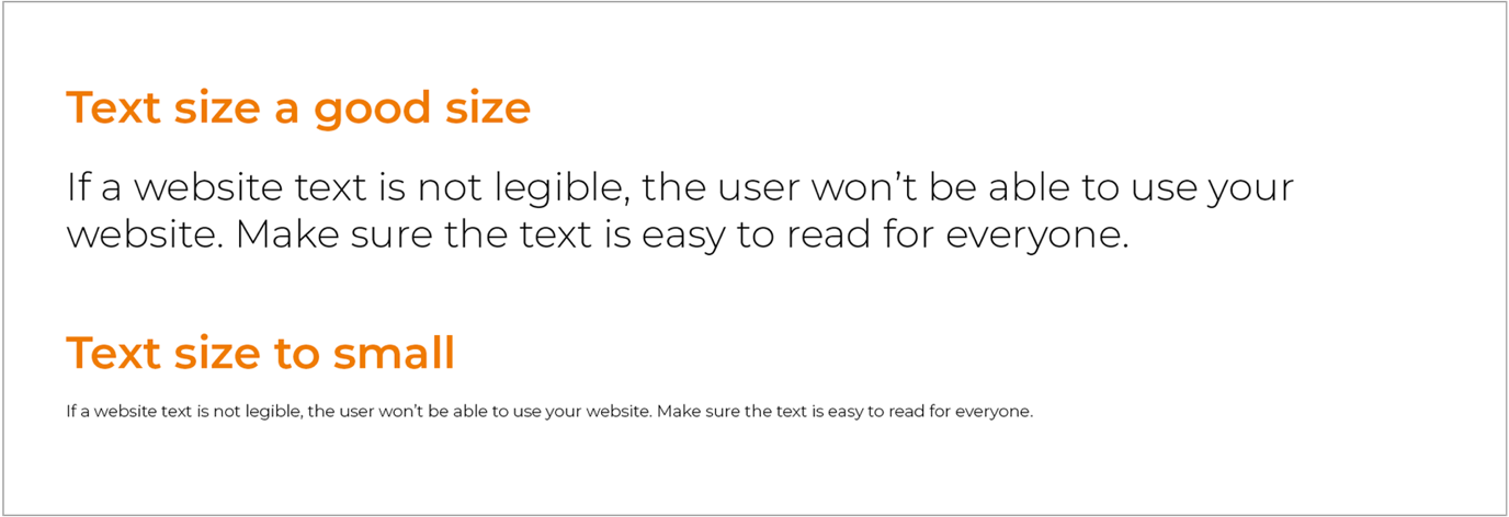
Figure 6. The difference between bigger text and text that is too small.
Justifying text
Justifying text may work in print design, but it is something to avoid in website design. Justifying text spreads out the words so they fill the whole content block, but this creates big uneven spaces between the words. The text becomes difficult to read for users and is considered bad typography.
Centre-alignment of text
Text that is centre aligned is generally harder to read because the eye works harder to find where the line begins to continue reading. Centre alignment can be used on a headline but should be avoided on long blocks to text.
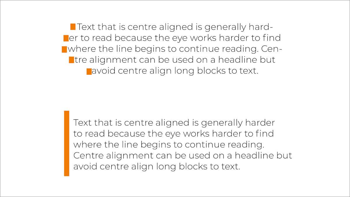
Figure 7. Centre-aligned text vs. Left aligned text.
Text on image
Text on images can be hard to read for the online user. If needed for text on images use a colour overlay to create a better contrast between text and image.
Using the wrong contrast in fonts
Avoid using low contrast, i.e. dark text on a dark background or light text on a light background. Reverse type should be used sparingly. Studies show that it’s much better to use black text on white, compared to white text on black. Sometimes reverse type can bring in a dramatic feel to the page, but it should be used sparingly and specifically for areas with minimal or bigger text.
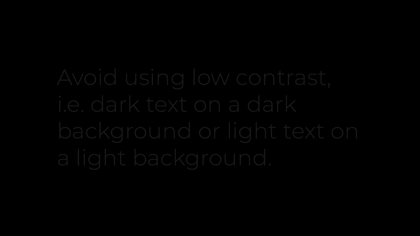
Figure 8. Dark text on a dark background colour is hard to read.
Long line length
Make sure you have a good amount of characters on each line, as this is important for usability. When the text line is too long, readers have difficulty focusing on the text itself. Studies show that the optimal line length should be 50 - 60 characters for a good user experience on a normal laptop or PC screen.
For smaller screen sizes, i.e. mobile, this number would obviously be less. Too narrow can also make the website text uncomfortable to read.
Avoid all caps
Having all your letters capitalised makes it harder for your user to read the text. It actually slows down the time it takes to read the content. Also, it gives the impression of shouting which is not a friendly user experience. If you need to use capital letters in some words, make sure not to write the text in caps but make use of the CSS text-transform property to change the style easily later.
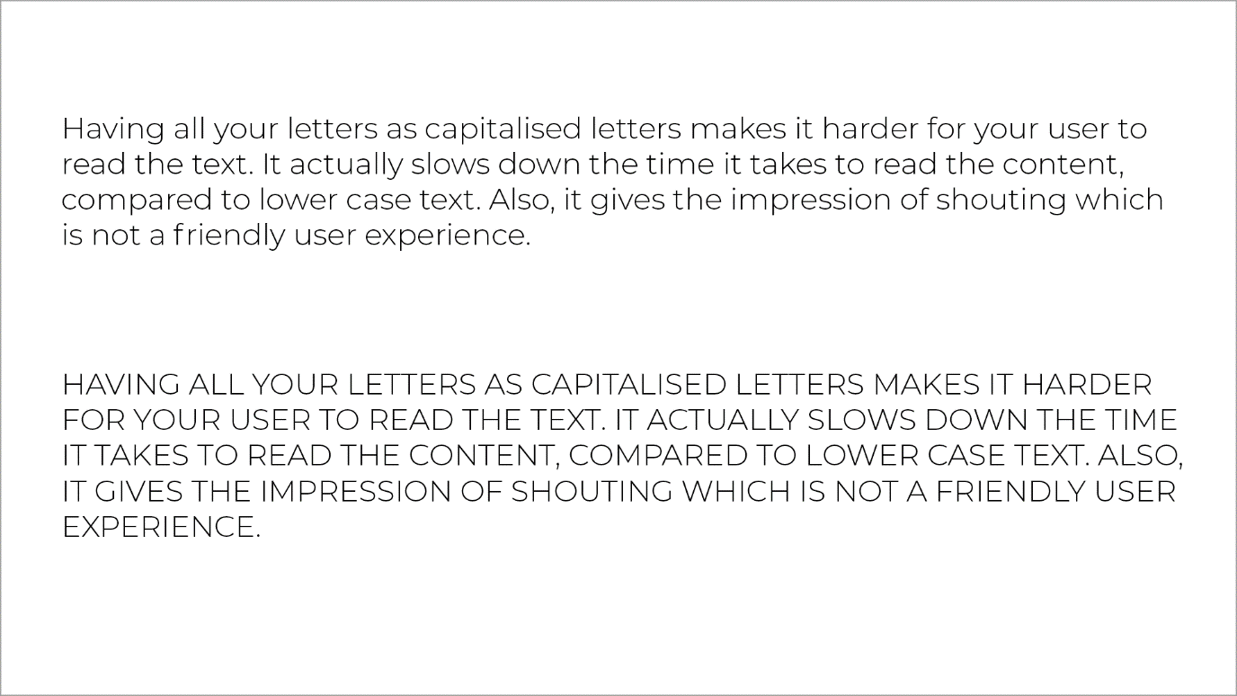
Figure 9. Using lowercase in paragraph text is a lot easier to read
Finding fonts for your design
Google fonts
Google fonts host the fonts on their servers. The service is free, has no issues with licensing, and you don’t need an account to use their website.
They have a wide range of custom fonts to choose from and are categorised for easy searching. Google fonts also give you the code you need to use, making the process very simple and easy.
The fonts can also be downloaded to use in graphics programs and for print.
Google fonts offer good support for browsers:
-
Google Chrome: version 4.249.4+
-
Mozilla Firefox: version: 3.5+
-
Apple Safari: version 3.1+
-
Opera: version 10.5+
-
Microsoft Internet Explorer: version 6+.
There are some disadvantages to using Google fonts:
-
They may slow down the rendering speed of your pages
-
Many websites use Google fonts, so you will see your font choice in other websites
-
The fonts are widely used, so best to avoid using the fonts in actual brand typography, for example in logos.
-
As the fonts are hosted elsewhere, if the service goes down there is nothing much you can do.
Using Google fonts for your website
Go to the Google fonts website and search for a font. Make use of the categories section to refine your search - as you can select categories like serif, sans serif, handwriting and others.
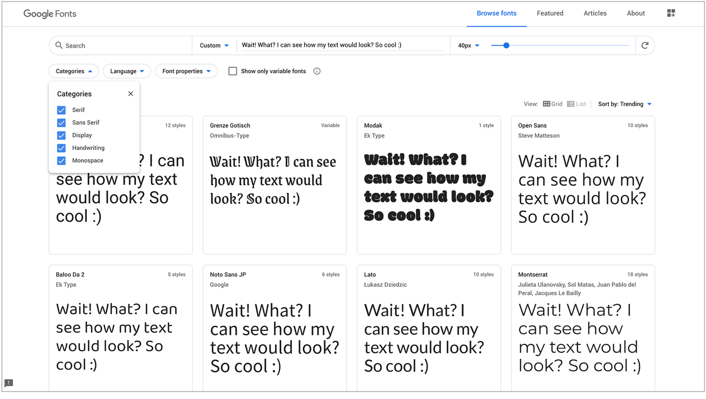
Figure 10. Google fonts (Google Fonts, 2020)
Choose your font and click on the + icon. A great way to preview your font and test out the fonts is to highlight the text and write your own text in its place.
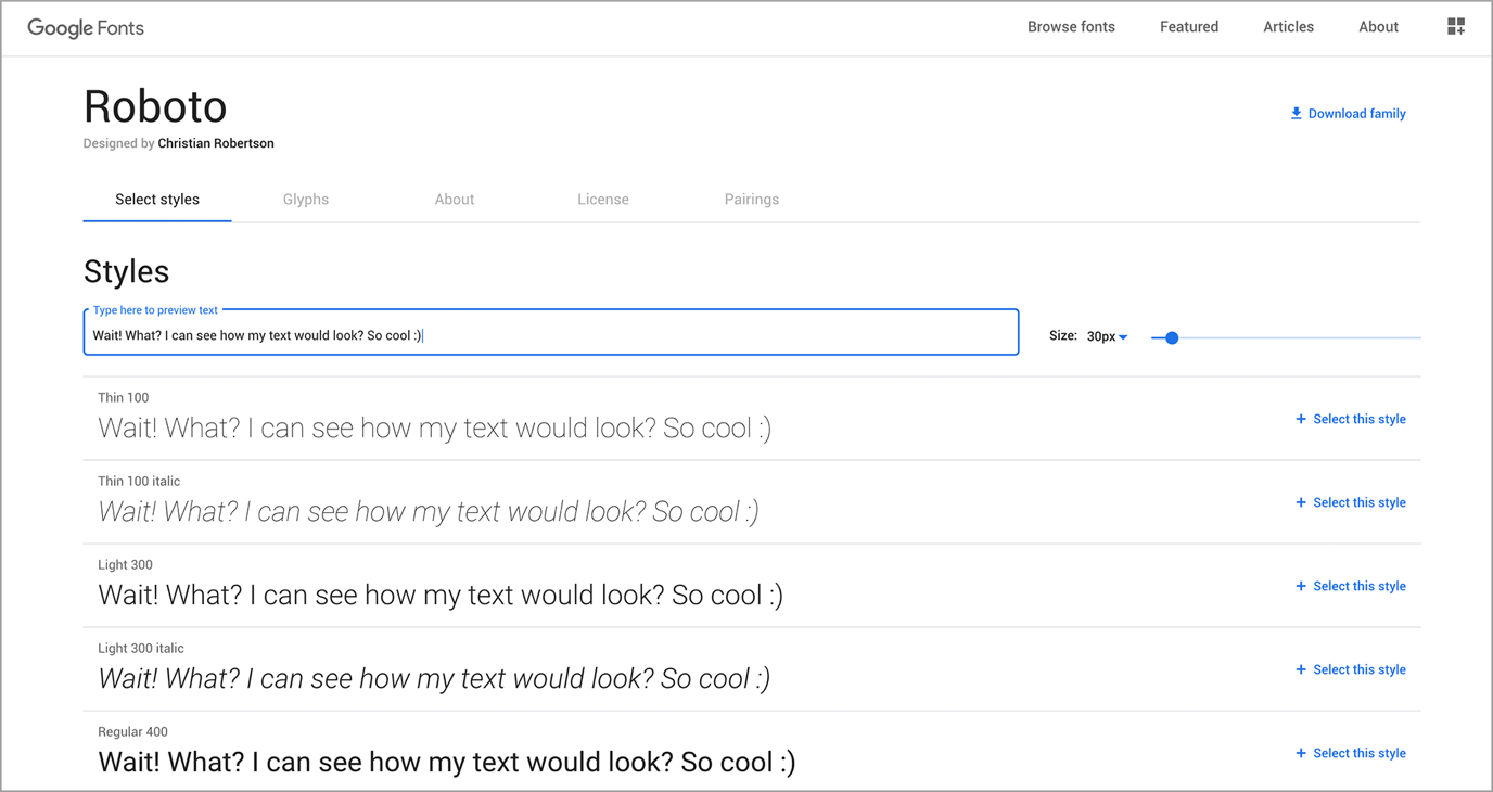
Figure 11. Applying a sample of text to all fonts (Google Fonts, 2020)
The embed tab shows the code to use. Copy and paste this code into your HTML and CSS files. There is link code for your font, which you can use in the /head/ tag of your html page. There is a standard option or import option.
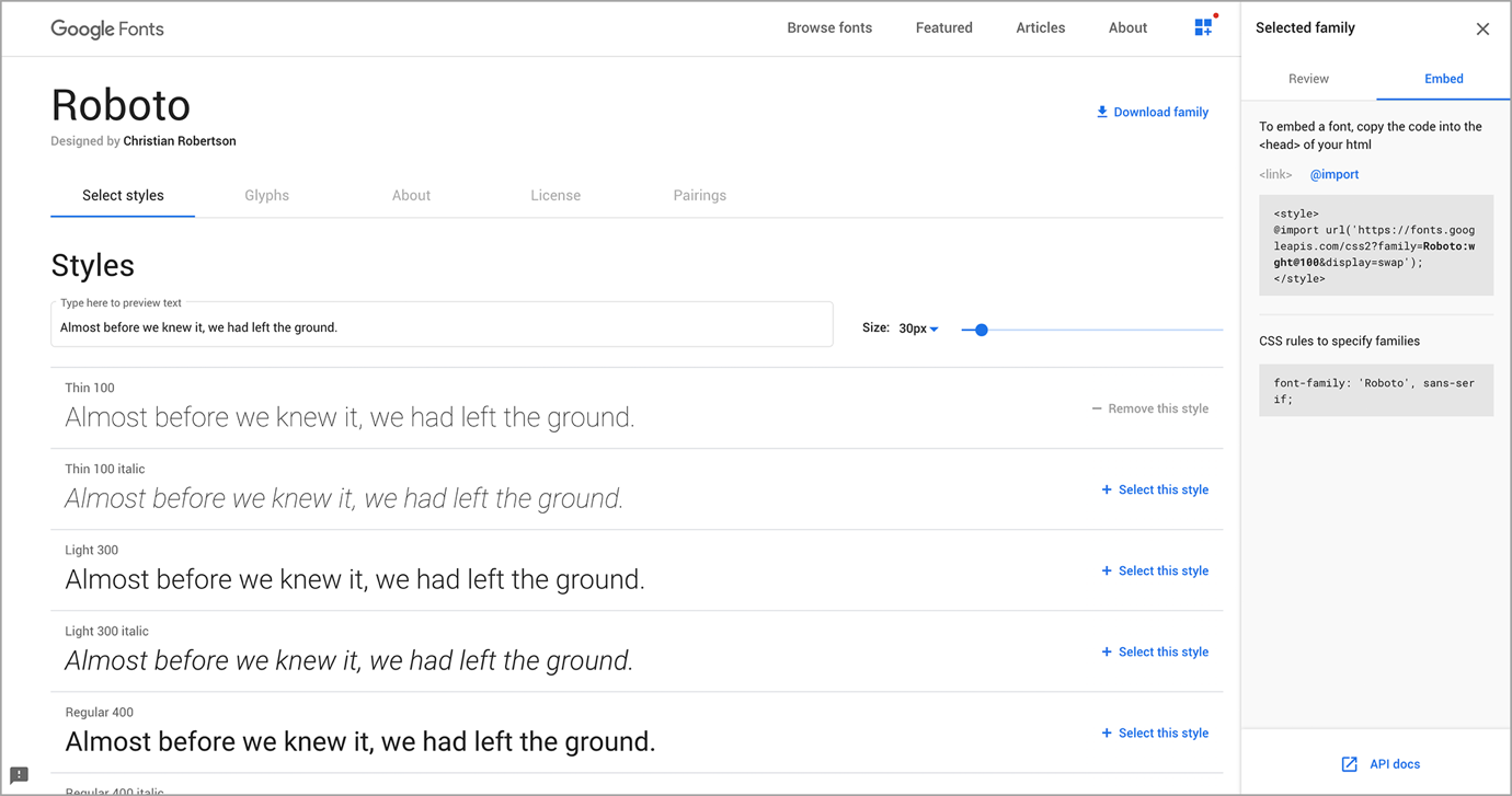
Figure 12. The embed tab showing the code (Google Fonts, 2020).
There is also CSS code for you to use in your CSS stylesheet. This CSS may then be applied as classes to various aspects of a pages, such to specific paragraphs, heading or all body text.
@font-face
@font-face is another way to use a font which the website user does not have installed. To use @font-face you must host the font on your server.
You should first find a font you want to use, download it, and then upload the font file to your webserver.
Browser support needs to be taken into consideration. Therefore, it is recommended to find and use fonts that are TTF, OTF, and WOFF as they are better supported on modern browsers.
Variable fonts
Variable fonts give designers the option of a range of font variants in a single font file. =Web fonts at the moment store each variation of a font in a separate file, for example: Roboto-Bold.ttf, Roboto-light.ttf, and there is not much variety.
Variable fonts offer this as a single file and gives more flexibility with weight, slant, grade, width, and other axis.
With CSS3, one can use the font-stretch property with different values which - until variable fonts came along - one could only use the values specified when providing different font files for each width.
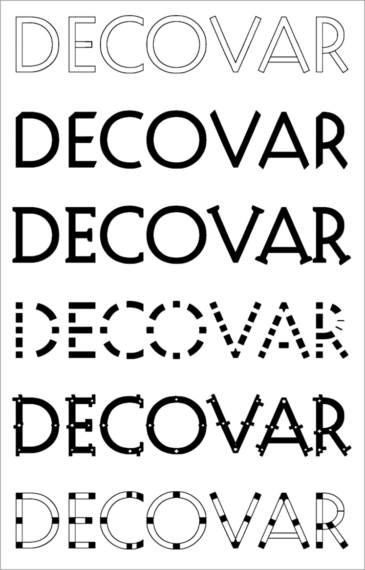
Figure 13. The decovar font in different variations.
INFO: If these concepts seem unfamiliar at the moment, don’t feel discouraged, it will be discussed later in more detail in the HTML and CSS course.
Activities
Activity 1
READ
Article: Introduction to variable fonts on the web
Activity 2
READ
From David Kadavy’s book Design for Hackers, section: ‘Enriching your typography’ (pages 262-264) (45m)
Bibliography
Babich, N., 2017. Building Better UI Designs With Layout Grids. [Online] Available at: https://www.smashingmagazine.com/2017/12/building-better-ui-designs-layout-grids/ [Accessed 23 June 2020].