Introduction
In this lesson, we will discuss the design principles that make a good UI design.
UI principles
When designing a product interface, the golden rule is to keep it as simple as possible so that the user stays engaged. Simple doesn’t necessarily mean ‘less content’, but rather that design choices should be kept uncomplicated.
Here is where the KISS acronym is handy to keep in the back of your mind. KISS stands for ‘keep it simple stupid’, a design principle used by the U.S. Navy in 1960.
It’s believed the simpler a system is to use, the better it will work for the end-user. Simplicity should be considered a key goal in every design. When a design or system is simple to use, it makes for good user interaction and, in the end, a good user experience.
Let’s look at some useful principles for interface designing.
Simplicity and clarity
An interface should be intuitive, straightforward, and easy to understand. When a design is uncluttered, it’s easier for the user to navigate the platform and quickly find what they are looking for. When there are too many elements and steps to reach the goal, it will overwhelm the user, creating the assumption that they need to ‘work’ to use the interface.
It’s safe to say that users scan through information rather than read through it; therefore, as designers, we need to focus our attention on keeping the overall design as simple and straightforward as possible.
Key questions
Here are some key question to ask yourself when designing an interface:
Could the interaction between the user interface and the user be more straightforward and more comfortable to use?
Think of a website that uses a hamburger menu as the main navigation. On a mobile device, this is acceptable since the screen’s size is small. On a desktop device, however, it creates an extra step for the user to perform.
Creating proper navigation that the user will see when they enter the site will make the interaction between interface and user faster and more comfortable. Look at the example below. When a user lands on the page, they will know exactly what the company is about and where each menu item will take them.
The interaction between the user and the interface immediately comes across as user-friendly and informative.
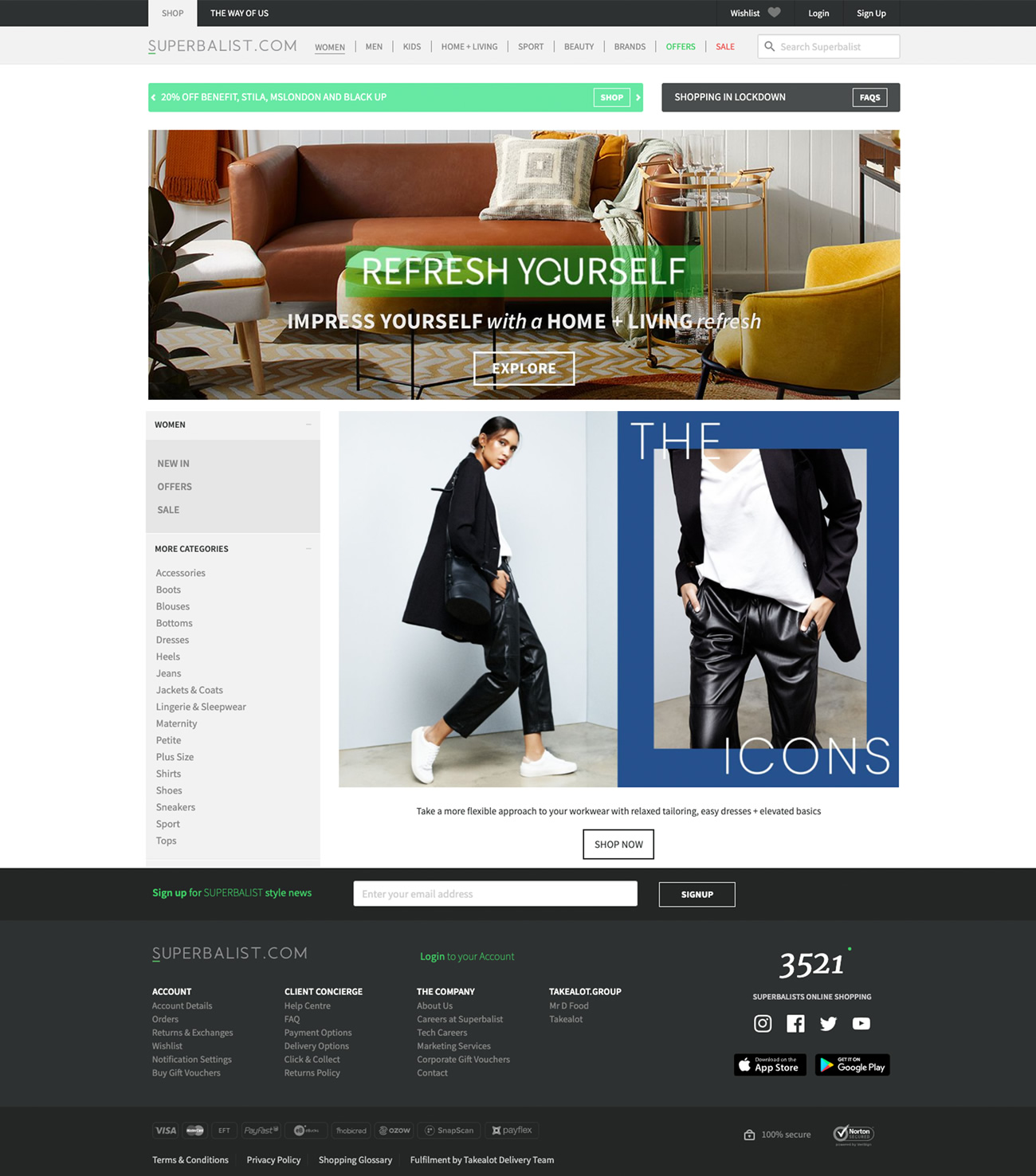
Figure 1: Good navigation gives the user a clear indication of what they can achieve on the website (Source: https://superbalist.com/women).
Could the colour choice and images be more simple and less overwhelming?
As we have previously learned, colours and images are essential in the overall design of an interface. Not only for aesthetics, but the brand relies on these to tell its story. Having too many colours and images, on the other hand, will create a cluttered design.
Think of a website with a busy background image, and on top of this image is another image and on top of this is coloured text with bad contrast to the image. Not only will the user feel overwhelmed, but the overall design will look cluttered.
The example below demonstrates a design with bad colour use and an overall cluttered look and feel. The user won’t know what to do or how to interact with the website. The choice in colour is also overwhelming and strenuous on the eye.
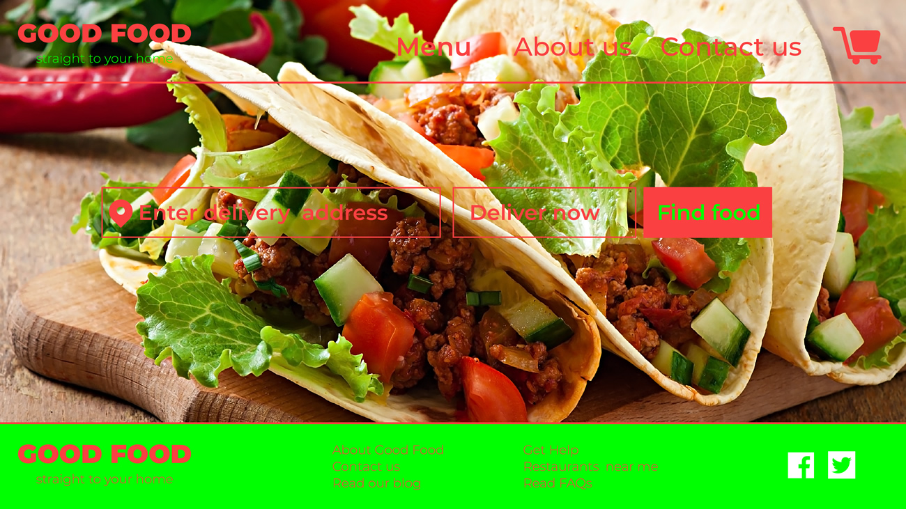
Figure 2: An example of bad use of colour and imagery.
Good use of colour ensures a more comfortable experience and will allow users to see what they need to do to reach their goal.
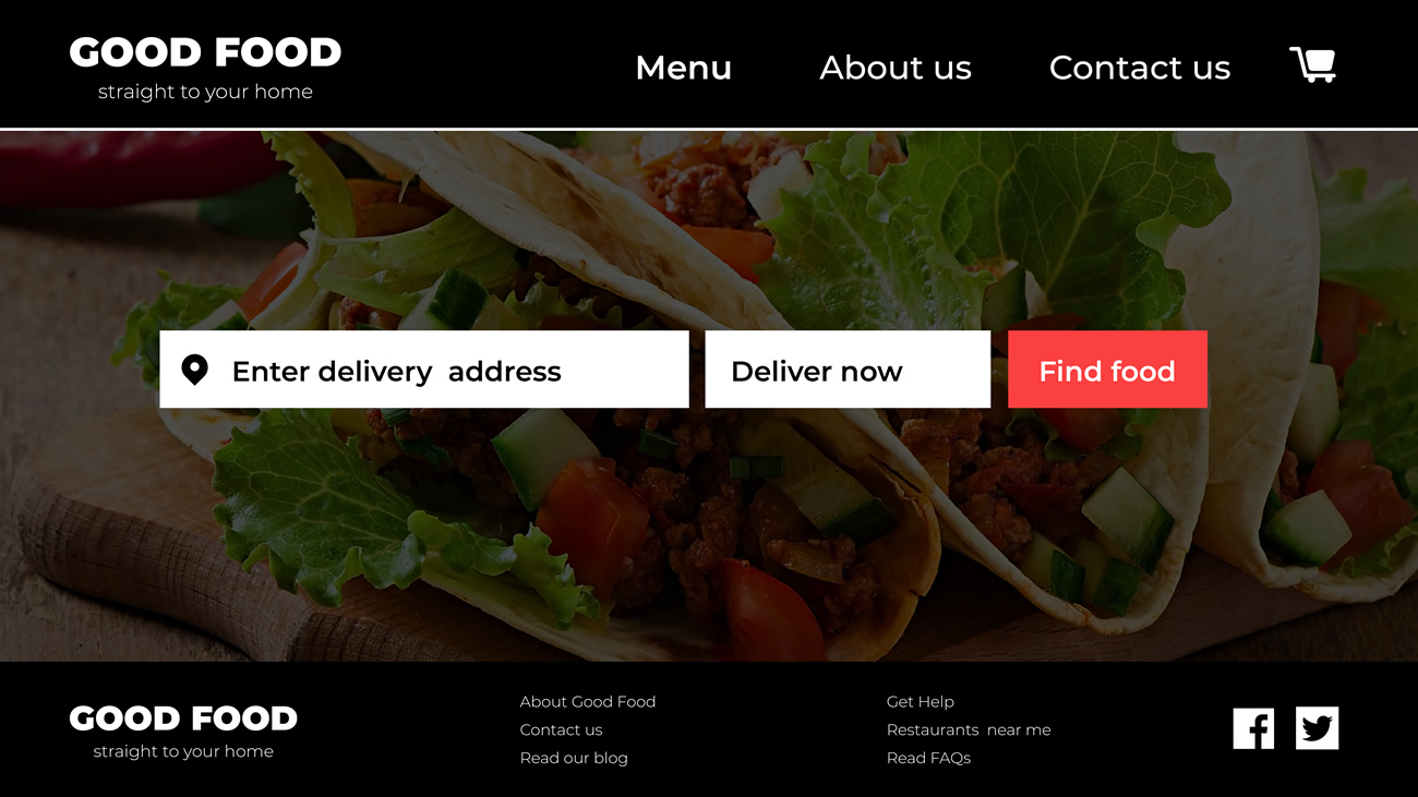
Figure 3: Better use of colour and imagery.
Does each design element serve a purpose?
User interface design should be meaningful. Each element used in the design should serve a purpose. As soon as elements are added to the interface with no purpose, the design becomes meaningless and confusing.
Before you add any component to your design, ask these questions:
-
does my design choice serve a purpose?
-
will it help the user reach their goal faster and more efficiently or prevent them from reaching their goal and make the overall experience unpleasant?
Don’t use elements to make the overall design appealing. Use elements to make the design purposeful. In the image below, we can see which choices were made to make the overall design purposeful.
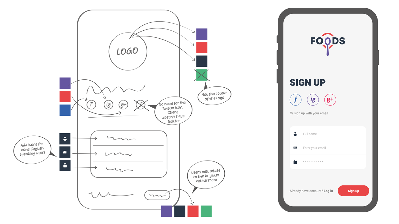
Figure 4: Good use of design elements that serve a purpose on the app design.
Structure and consistency
It’s essential to have information well organised and structured logically. Elements should be consistent, and the layout should be easy to understand and approach.
There should be an informational and typographical hierarchy. The text must be distinct, and there must be adequate spacing to separate sections and ensure legibility. Buttons and call-to-actions should be highlighted and easy to spot.
Navigation should always be straightforward. Look at the example below. The user’s eye will go to the logo first, and then it will travel across the main navigation to the sign-up CTA, then down to the header and written text and then across to the second CTA.
Also, pay attention to the use of colour on the page. It’s consistent from top to bottom, and the buttons are bright and prominent.
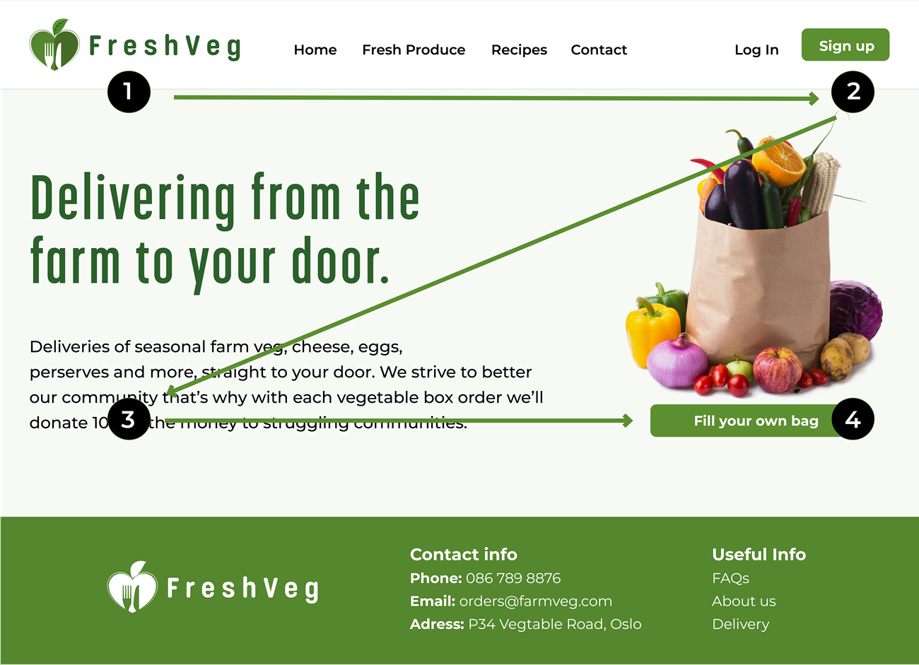
Figure 5: Good page structure and consistency
Flexibility
The design should be adaptable and look good in all situations - on a brand-new iPhone, an old desktop PC and a slick MacBook Pro. This ties in with accessibility and legibility, important factors to consider when you start the design process.
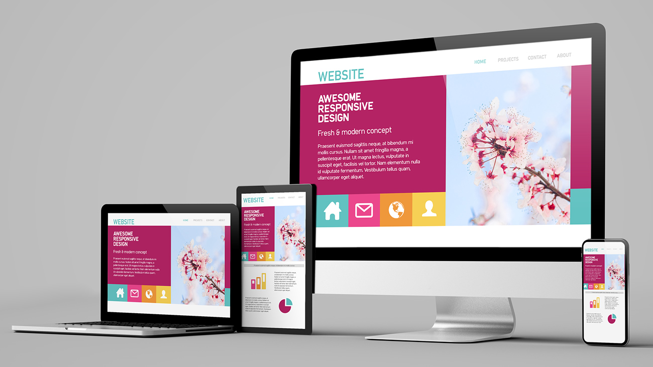
Figure 6: An example of good responsive design.
Familiarity
Users respond well to patterns they know and feel comfortable using. There is no need to reinvent the wheel when designing a UI. Things like common colour associations (like red for sale, green for available, etc.), navigation menus (like the hamburger menu on mobile) and call-to-actions (button formats, copy used, etc.) are familiar patterns.
The example below shows two different confirmation messages. The one on the left will be more familiar to users than the one on the right because of how the pattern is presented. The confirmation message on the right is confusing, and users could instantly feel uncomfortable.
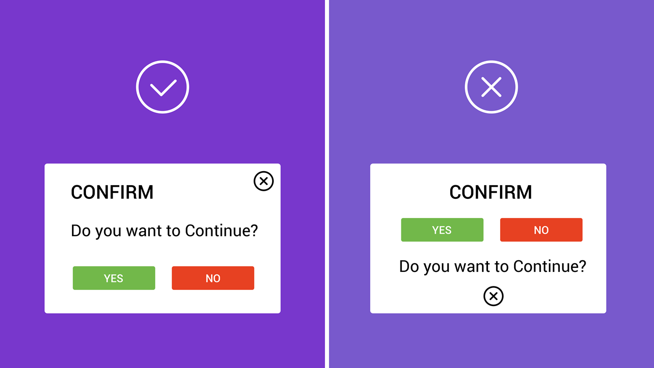
Figure 7: Two examples of confirmation messages.
Feedback and user control
A user should always feel in control when using an interface. They should know where they are, how they got there, and what the next step is. It ensures a confident and informed user who will have a good experience.
The example below shows how the user is in control of the checkout process. Every step is indicated by the process bar. The user even has a way to back out and start over. The information icon will provide them with extra information if there is uncertainty. The bright green CTA is prominent and guides them further through the process.
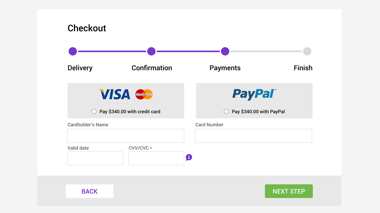
Figure 8: An example of good feedback and user control.
Activities
Activity 1
READ
In the book, ‘Don’t Make Me Think’, read the following chapters.
- Chapter 6: Street signs and Breadcrumbs
- Chapter 7: The Big Bang Theory of Web Designy
Activity 2
WATCH
Video: The UI designer’s role (4m 42s)
Activity 3
WATCH
Video: 10 Rules of Good UI Design to Follow (5m 5s).
Lesson Task
Brief
For this task, you will be using the UI elements and patterns you have gathered and designed in lesson task 1 to create three pages for the Mobile Meals app. You can decide which three pages you want to design, for example, the homepage, the restaurant page, and a login page.
The target audience for this app is aged between 25 and 35. They have busy schedules, so cooking time is limited and ordering food online is more convenient to accommodate their busy lifestyles. Popular restaurants include The PizzaGuy, The BurgerBar and PlatedFresh, a restaurant specialising in healthy food.
Level 1 Process
- Make a quick sketch of how the layout and placement of elements will potentially look.
- In Figma create an artboard for any mobile device.
- Focus on what you’ve learned about UI principles and apply your knowledge to your app’s design.
-
Ensure the navigation on the app is straightforward and easy to comprehend.
- Ensure the elements are neatly displayed and have a purpose. Make use of a grid structure to help you place elements on the page.
-
Design components and elements should align correctly. This will ensure a neat layout throughout.
-
The use of colour and typography should be consistent.
-
Consider the app’s navigation.
- Most importantly, remember to KISS (keep it simple stupid).