Introduction
Planning and structuring when placing elements on a web page do not only achieve an appealing design. These tasks also help the online user to comprehend information. In this lesson, we will discuss the principles of layout/composition and have a look at the anatomy of a grid structure.
NOTE: This lesson contains 4 activities for your completion.
Basics of layout/composition
In the design industry, the terms “layout” and “composition” are used interchangeably. This is because they refer to the same concept.
Composition in artwork refers to the placement and combination of these elements that create the finished piece. Like a puzzle, all the pieces must perfectly fit together to form the final picture. If the different elements are placed smartly, they will enhance/draw attention to one another, and you’ll create an impactful design. Different elements are organised according to the principles of art (line, shape, colour, value, form, texture, and space).
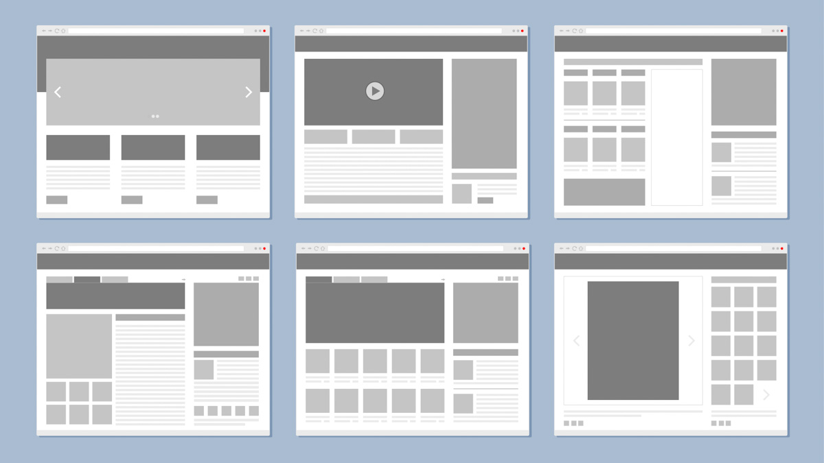
Figure 1. Example of website layouts
Composition not only applies to visual art. The term composition means “putting together” and can be applied to any form of art – from music and writing to sculpting, and photography. It can also be applied to the world of graphic design and desktop publishing.
In the visual arts, the word “composition” can be replaced with various terms such as design, form, visual ordering, or formal structure (depending on the context). In graphic design and desktop publishing, composition is commonly referred to as page layout.
The history and use of layout
The history of layout correlates with the history of communication itself - once communication started in written form, layout naturally followed. For this reason, each culture has its own interpretation and development thereof. Although common principles extend across all cultures, it will be useful for you to study and observe specific cultures and their interpretation of layout. Designers often find inspiration in the different approaches of other cultures. It is important to remember, though, that the audience must still be able to easily understand what is being communicated.
Layout has its roots in the hand-copied books of the Middle Ages. The principles in layout were further developed once the printing press was created in the 1400s. Today, layout is a vast field that includes complex designs, like magazine and catalogue layouts. Proper page design is required for print design and web design. Both print and screen-based media elements usually consist of type (text), images (pictures), and place-holder graphics.
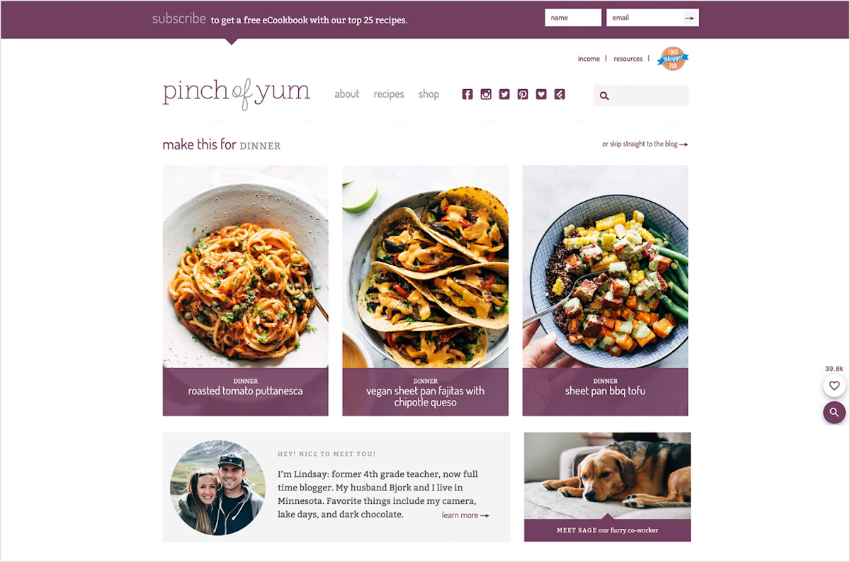
Figure 2. Example of elements used on a website (pinchofyum.com, 2020)
As technology developed, our approach to layout progressed. We are now able to use advanced equipment to produce many different effects which previously had to be done by hand. Visual and audible communication has also developed – we are now able to use a combination of picture and sound to communicate our message. In fact, we are able to interact with the viewer in more ways than ever before! This impacts on our understanding of and the possibilities of layout and the conveying of information.
When working with layout, consider whether the design will eventually be produced in print, such as magazines and newspapers, digitally such as online, or as a combination of both print and digital media. It will help you to decide on the different elements you need to add, for example, interactive elements (which will only work on digital media). Also, look at how these elements will influence the layout. For example, where you would have to use written type or visuals and graphs to communicate extensive data in print. You could make this more expansive on digital media, using interactive animations of graphs that reveal data in layers and at the viewer’s own pace.
Bear in mind the digital or electronic page is better known as a “graphical user interface” (GUI) when interactive elements are included. It usually includes interactive elements and multimedia that are added to the usual elements (text and still images). What makes interactivity relevant is that it gives designers the chance to take page layout to another level. You now must do more than just attract the viewer’s eye; you need to create a user experience.
It is best to create rough pencil sketches before your design is produced on the computer. It is also important when it comes to layout, whether it is for print or website design. It doesn’t mean you have to limit yourself - as the different production methods branch out, so do the many possibilities of communication. So, if you have new ideas while you design, especially when it comes to interactive media, explore them!
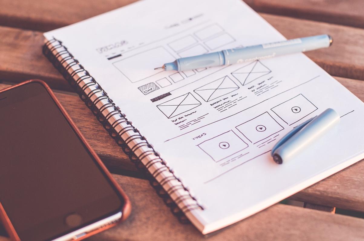
Figure 3. A simple sketch before work on the computer starts (Pexels, 2016)
It is essential to know that the fundamentals we discuss in this lesson will always apply and help you to organise information in a way that is easy for the viewer to understand.
The principles of layout
Good design is CRAP. CRAP is an acronym of the basics of design - contrast, repetition, alignment, and proximity. These practices can improve visual hierarchy, readability, appeal, and order to the overall design.
Contrast
All visual elements looking the same on a web page can make a design come across as dull or uninspired. Imagine a website where there is no contrast between images, or the only visible colour is black and the text is the same size throughout with no headings, subheadings, or body text. Contrast creates visual interest and helps to attract the viewer’s attention to vital information. There are methods that can help to achieve contrast in a design – these include size, shape, direction, and colour.
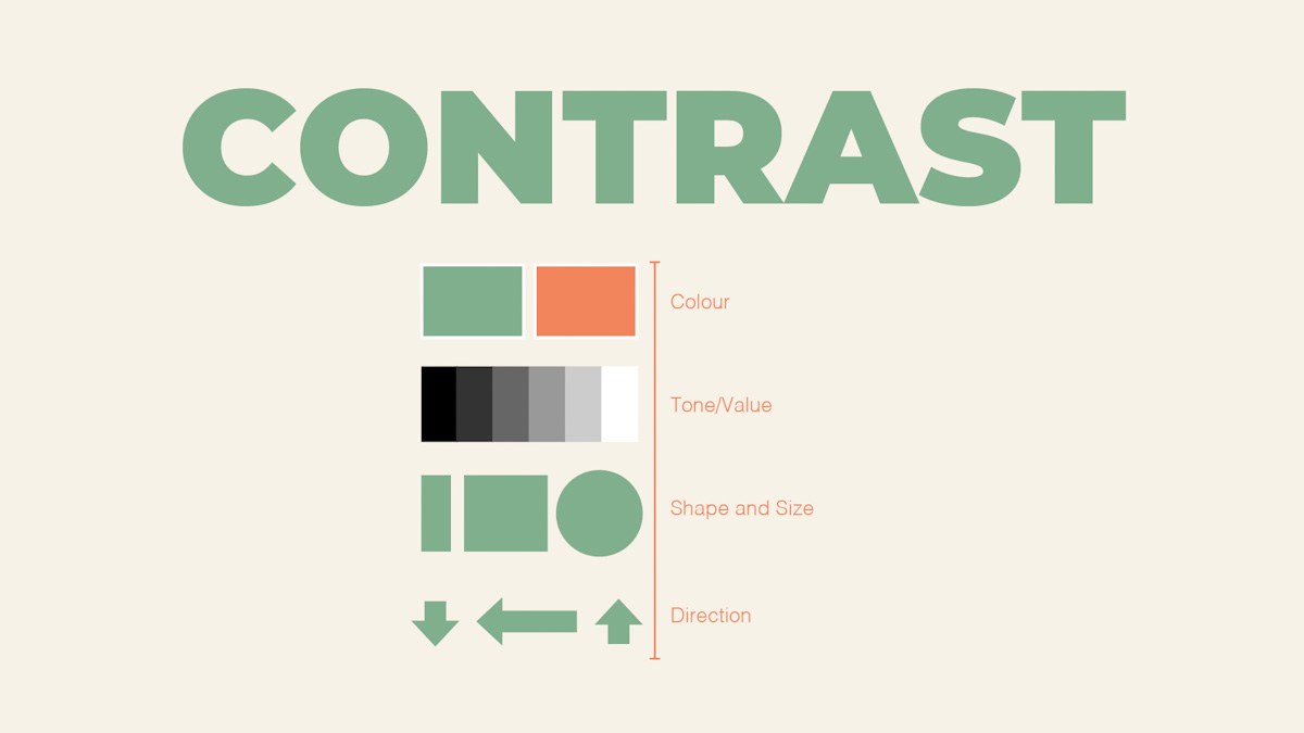
Figure 4. Methods to achieve contrast (Archibald, 2012)
Repetition
Repetition allows for consistency in design. It refers to the reusing of similar design elements, such as a specific font, or a border around an image, or even a colour. If those elements are continuously used, repetition occurs. Not only does repetition bring consistency to a design, but it also helps the designer to create a design style that will hopefully be remembered by the user.
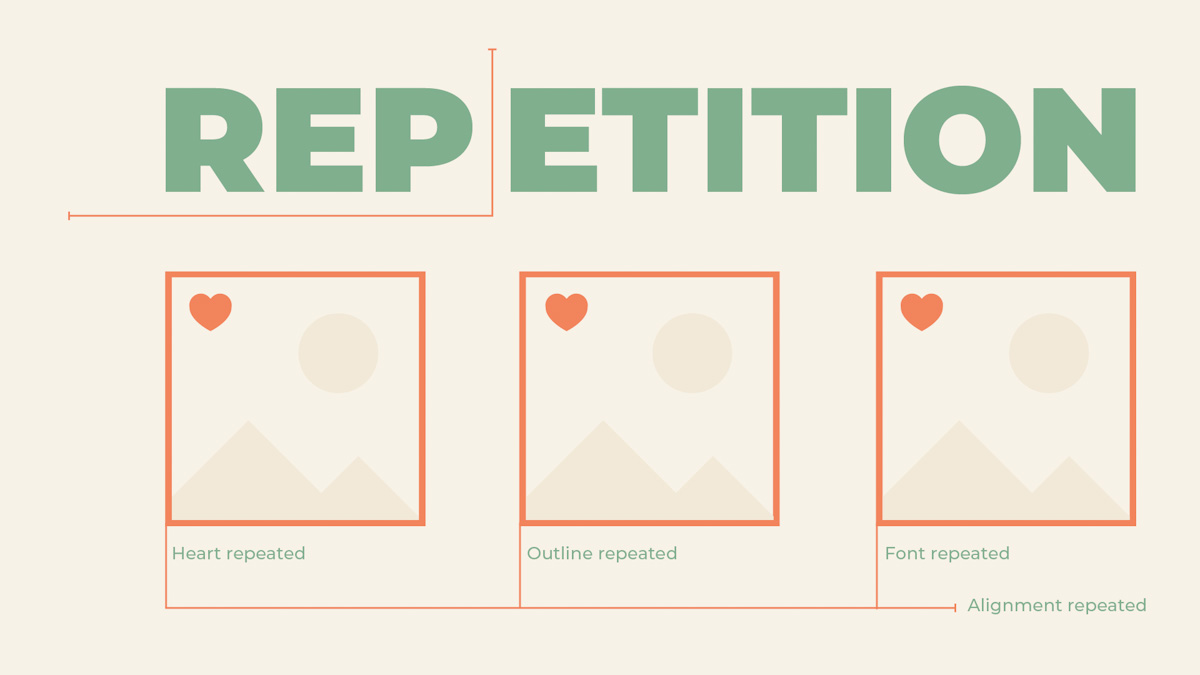
Figure 5. An example of repetition in layout and composition (Archibald, 2012)
Alignment
Alignment refers to text and design elements - such as images and icons - that are placed on a page so that they line up in relation to each other, or in relation to the page on which they are placed. Proper alignment creates order and helps organise visual elements to increase readability. Elements can be left-aligned, right-aligned, centre aligned (horizontally), centre aligned (vertically), bottom aligned and top aligned.
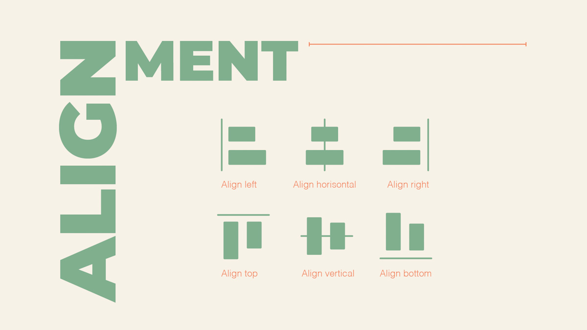
Figure 6. The different alignment methods (Archibald, 2012)
Proximity
The principle of proximity is practised when related design elements are placed together or close to each other. Proximity creates visual unity in design and helps to organise elements to increase comprehension for the viewer.
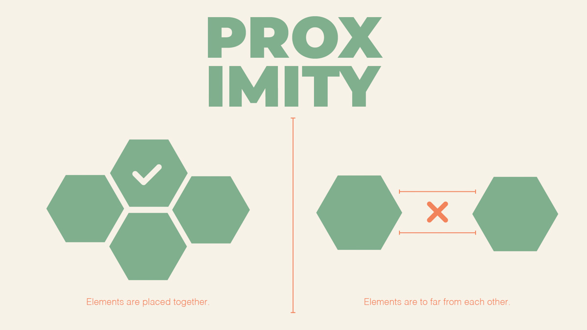
Figure 7. An example of proximity (Archibald, 2012)
Grids
Now that we have discussed the importance of the basic principles of layout and composition, knowing how to organise these is equally important. A building plan is shown as a blue piece of paper with a superimposed white grid. The grid demonstrates the alignment of walls on the plan. Grids serve a similar purpose for a web designer, guiding the designer where to place content on a page, and ensuring consistency and hierarchy (Babich, 2017).
Let’s take a look at the different parts of a grid system.
Format
Just as an artist uses a canvas to paint on, the format is the area or space where you would place your design elements. In this area, you would use the principles of layout to bring together the visual aspects of your design. In print, this space is called a page and in web design a browser window (Velarde, 2018).
Figure 8. Example of a blank page in Figma.
Margins
A margin is the outside space around the border area that would contain the content. Margins and padding are often confused since both are used to add space to design. The difference is that margins are the outside space, whereas padding would be the inside space.
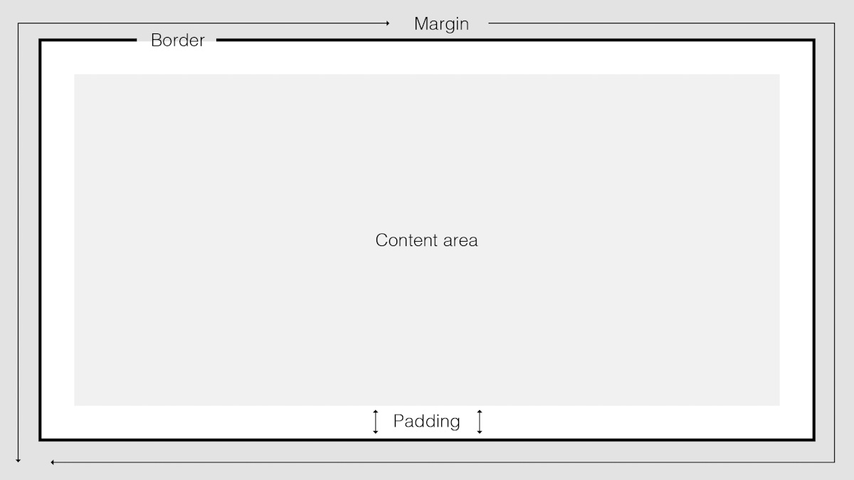
Figure 9. Example of a margin, border, and padding.
Columns
Columns are the vertical parts of a grid. Some might say the more columns in the grid, the more flexible the website design will be (Coyle, 2014).
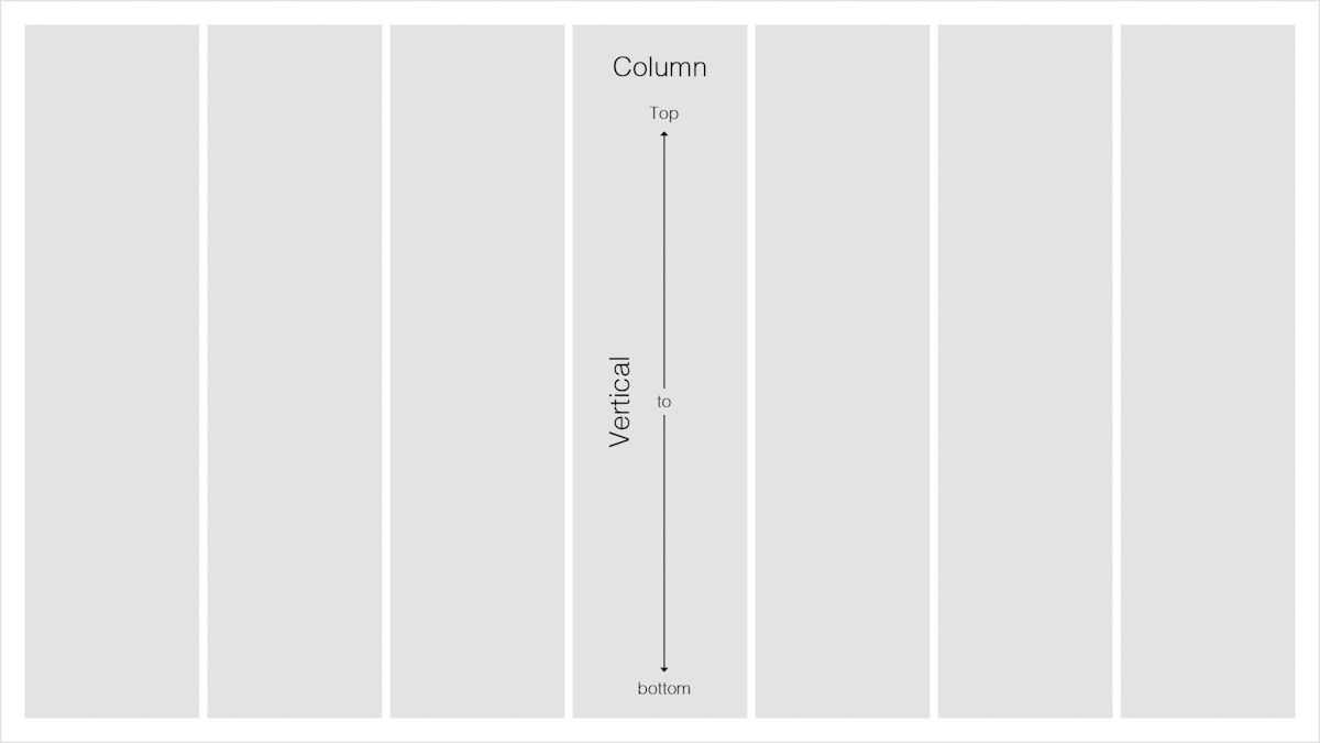
Figure 10. Example of a column.
Rows
Unlike columns that go from top to bottom, rows are the horizontal parts of a grid that stretch from left to right.
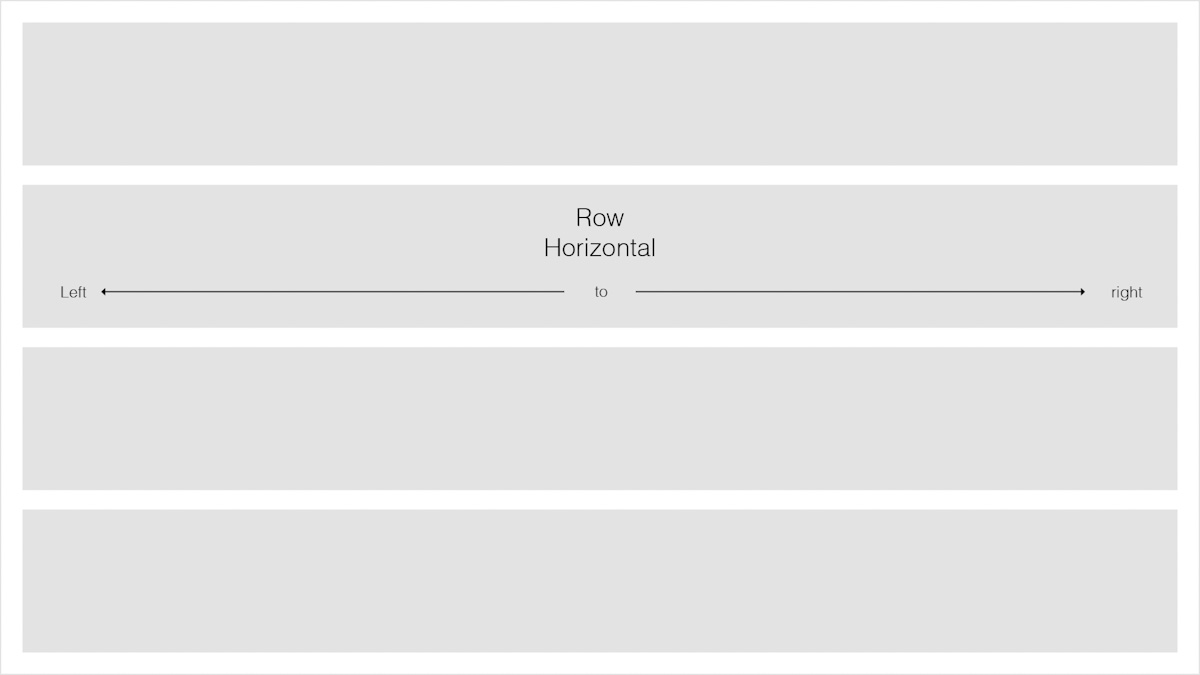
Figure 11. Example of a row.
Modules
In the same way that streets intersect and create intersections, modules are the space where columns and rows overlap each other and create intersections.
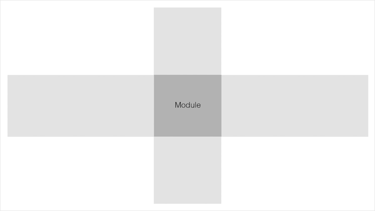
Figure 12. Example of a module.
Gutters
Gutters are the white space in between columns and rows. The smaller the gutter area, the less breathing space the visual elements will have and the greater the tension between them would be. With gutters that are bigger, you’ll find a more calming layout, because the visual elements would have more breathing space. White space can also be seen as an essential principle of layout and composition since it helps you to separate different sections from each other and provides some design elements room to breathe (Coyle, 2014).*
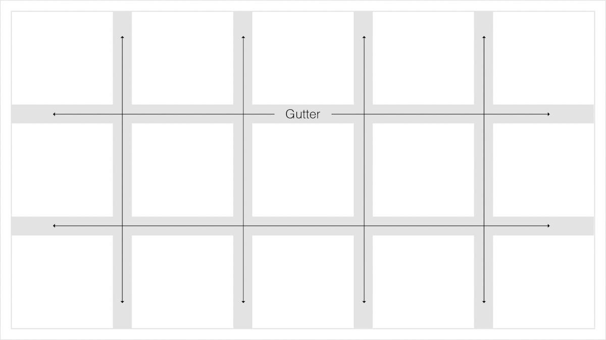
Figure 13. Example of the gutter.
Flowlines
Flowlines help to lead the eye from one side of the page to another. They are also used to break up content in horizontal parts. Flowlines can also be used to align images and text. There are two primary types of flowlines called hang lines and baselines (Bradley, 2011). Hang lines refer to the top of a flowline, whereas baselines refer to the bottom.
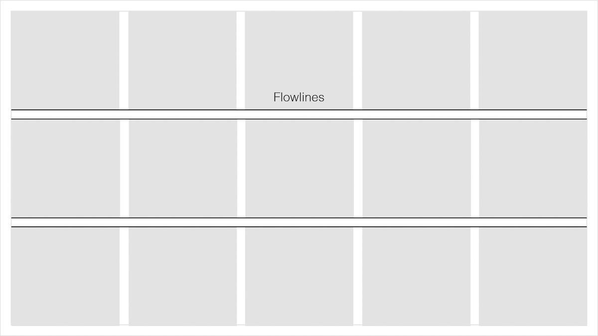
Figure 14. An example of flowlines on a page.
Spatial Zones or Regions
Regions or spatial zones are when columns, rows, or modules are combined to form a space for composition (Coyle, 2014). For example, a horizontal zone can hold a photo or video, and a vertical area can be used to hold a paragraph of text. Knowing how to work with regions and spatial zones can help you to organise content (Velarde, 2018).
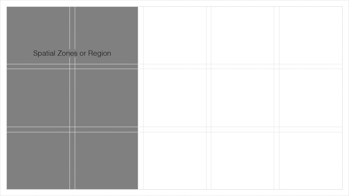
Figure 15. An example of spatial zones or regions.
Types of grids
Now that you have knowledge of the anatomy of a grid, the ability to identify the different types of grids will enable you to use various design elements and create flowing layouts that will make navigation for the user effortless. There are four main grid types, namely the manuscript grid, hierarchical grid, column grind, and the modular grid.
Manuscript grid
The manuscript grid is the simplest grid structure of them all. It is basically a singular grid structure consisting of one column which takes up most of the space on a format or page. These are often made up of large blocks of text and are commonly used in blog posts and books. Microsoft Word, for example, will always use of the manuscript grid structure. So basically put, if the primary purpose is to have text, this structure is the best one to use.
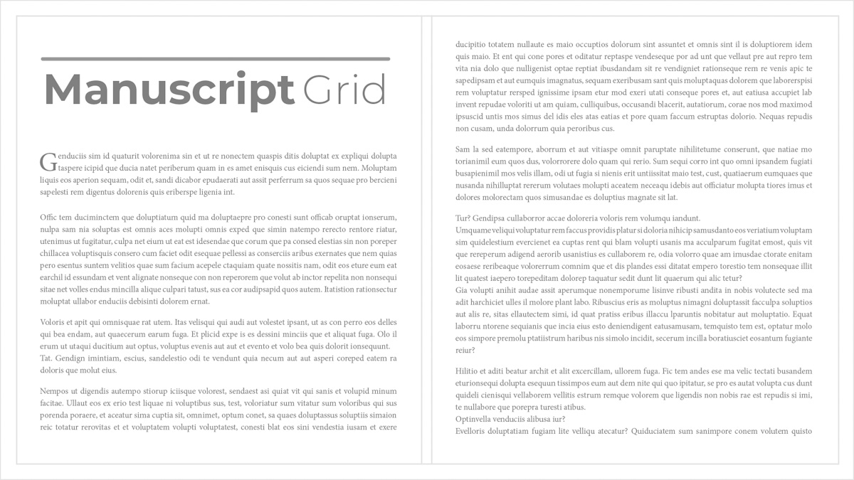
Figure 16. An example of the manuscript grid.
Hierarchical grid
The hierarchical grid structure is often used on websites. As the name suggests, the most important elements are placed strategically so the user can notice them at first glance (Coyle, 2014). This type of grid is also often used when the content is not standardised.
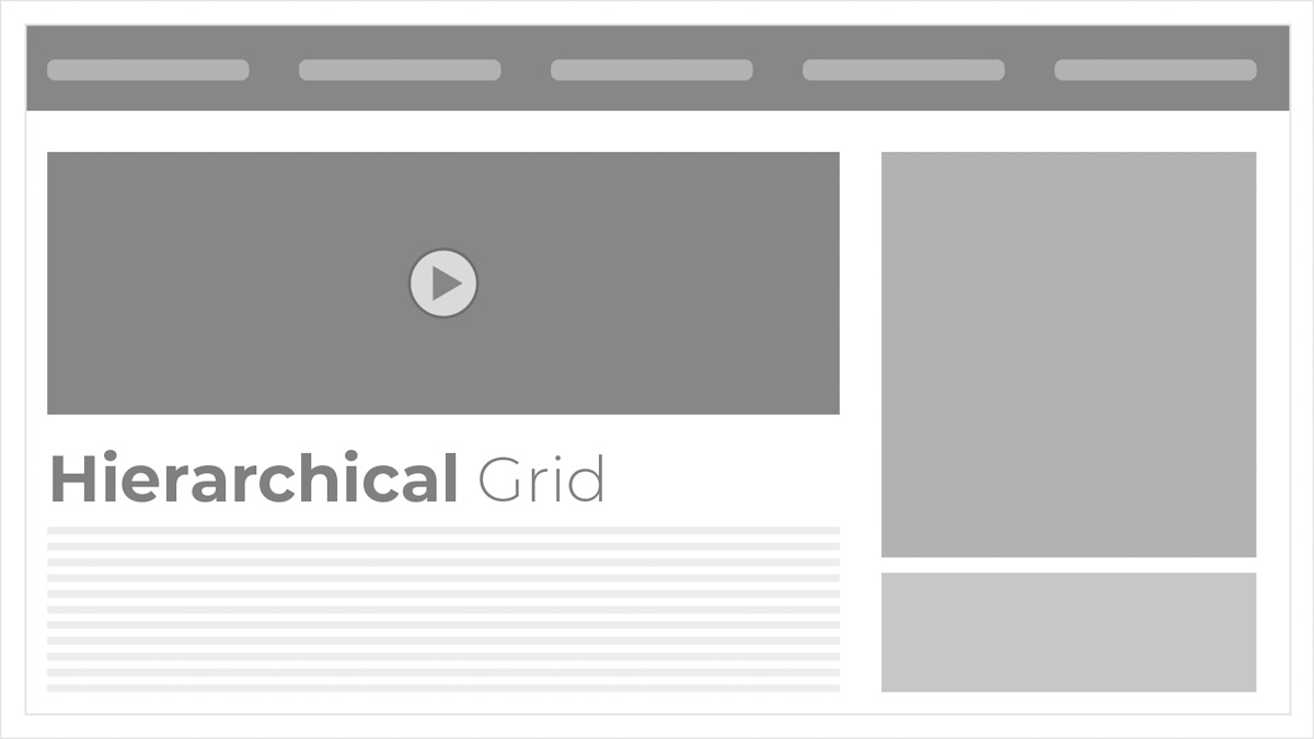
Figure 17. An example of a hierarchical grid.
Column grid
The column grid is probably the most common grid structure in website design. Magazines use them as well since this grid structure helps organise text and images in evenly spaced columns across the page. The number of columns can be anything from as little as two to as many as twelve. There are two types of column grids, namely symmetrical and asymmetrical column grids.
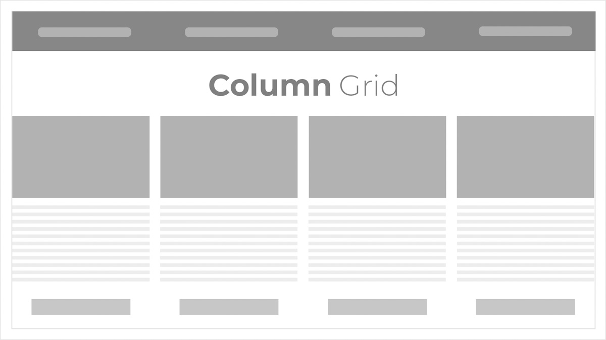
Figure 18. An example of a column grid.
Modular grid
As mentioned earlier, a module is situated where columns and rows intersect with each other. Simply put, a module is the result of columns and rows that overlap. The overlapping parts form a space called a module. A modular grid is used when a column grid is inadequate and when more structure is needed to organise content. Two are better than one, so columns and rows are used for organising content. Newspapers often use this grid structure to give structure to articles.
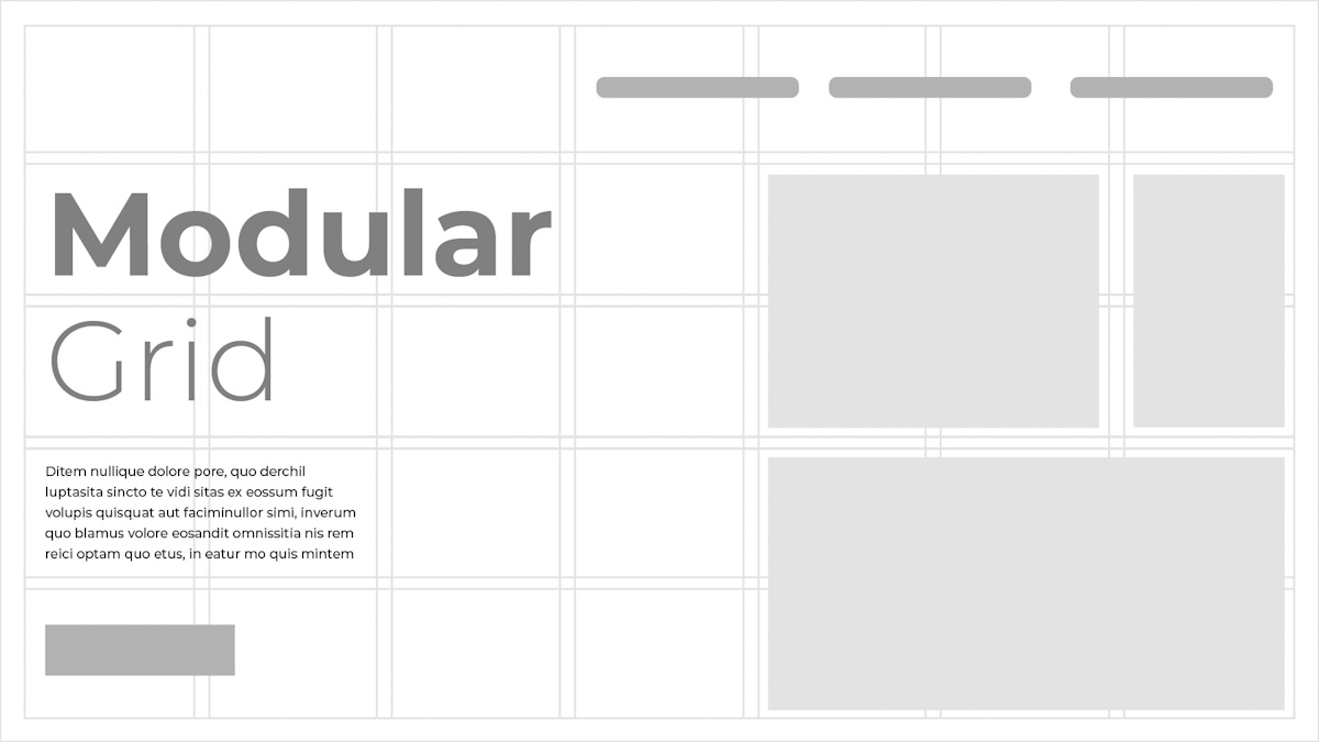
Figure 19. An example of a modular grid.
Grids are everywhere you look. Our whole world is built on grids since they add structure to art, design, and our daily lives. With time and experience, you can learn to work outside the grid. But before you can break the rules, you need to know them. Often when designers know how to break the rules, they manage to create art that would set them apart in the industry of design.
Figure 20. An example of a layout and grids.
Activities
Activity 1
WATCH
Video: Introduction to Layout: Free Web Design Course (15m 21s) by Flux Academy
Activity 2
READ
Article: A Quick Look at Types of Grids for Creating Professional Designs by Orana Velarde.
Activity 3
READ
Article: How to Use C.R.A.P. Design Principles For Better UX? by Nitin Deshdeep.
Activity 4
WATCH
Video: Figma Tutorial: Setup a Responsive Grid Layout for UI & Web Design (11m) by Mizko
Lesson Task
Goal
Practise how to use grids in Figma for layouts that are easy to comprehend and easy to follow.
Brief
Every website is unique but there are some common components that we can recognize in nearly every webpage. Some of the elements are so important that exclusion can cause confusion for users. Also, use of the grid is one of the most important components that you can find in almost every webpage. Many websites use the same grid, but they still wind up looking unique.
Do a brief analysis of three websites of your choice and try to identify the various elements on each website, by answering the following questions for each site:
- Does the website have a grid? If so, what grid structure is being used?
- Which layout principles can be identified in the design? See if you can recognise all of them.
- What design elements are present on the site? Remember, design elements are items such as a logo, video, text and/or images.
- Look at the images, text, and other elements. What alignment technique (left align, centre, or right align) is being used to align these elements?
Level 1 Process
- Open Figma and create a new page (1920 x 1080px).
- Make sure your page consists of a proper grid structure.
- Lay the various elements out on your page. Use shapes such as squares, circles, and lines to represent design elements. For example, a square with a play button can represent a video and horizontal lines can represent text.
- Make sure you employ proper alignment and spacing for the various elements on your page.
Bibliography
Babich, N., 2017. Building Better UI Designs With Layout Grids. [Online] Available at: https://www.smashingmagazine.com/2017/12/building-better-ui-designs-layout-grids/ [Accessed 23 June 2020].
Velarde, O., 2018. A Quick Look at Types of Grids for Creating Professional Designs. [Online] Available at: https://visme.co/blog/layout-design/[Accessed 23 June 2020].
Coyle, A., 2014. The Anatomy of a Grid. [Online] Available at: https://uxdesign.cc/the-anatomy-of-a-grid-c955d5355fae [Accessed 23 June 2020].
Bradley, S., 2011. Anatomy of a Modular Typographic Grid. [Online] Available at: https://vanseodesign.com/web-design/grid-anatomy/ [Accessed 23 June 2020].
pinchofyum.com, 2020. Pinch of Yum. [Online] Available at: https://pinchofyum.com/ [Accessed 1 July 2020].
Pexels, 2016. pixabay.com. [Online] Available at: https://pixabay.com/no/photos/planer-design-webdesign-designer-1867745/ [Accessed 1 July 2020].
Archibald, J., 2012. Paper Leaf. [Online] Available at: https://paper-leaf.com/blog/2012/10/principles-of-design-quick-reference-poster/ [Accessed 1 July 2020].