Introduction
In this lesson, we’ll discuss wireframes and how it helps other team members visualise what could be placed on a page and what should be avoided. It’s also a great tool to use for feedback and to brainstorm ideas.
What is a wireframe?
As you continue the journey to becoming a front-end developer, you will hear the word wireframing quite often. A wireframe is the first step a designer takes to put an idea to paper. It makes sense that wireframes are also called blueprints, and just like a blueprint, a wireframe provides the designer with guidance.
Not only are wireframes there to get the structure and layout of a page in order, but it is an excellent way to organise ideas and test new ones. It also allows designers to see how users can interact with an interface beforehand.
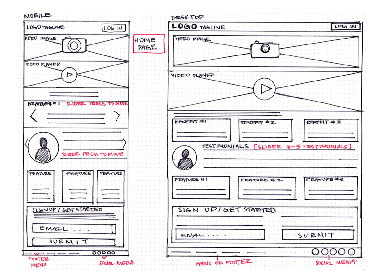
Figure 1: An example of a hand-drawn wireframe (Source: careerfoundry.com)
Purpose of a wireframe
Wireframes are static representations of the design, and should essentially answer the following questions:
-
How will the structure and layout of the page look?
-
What information will be displayed on the page?
-
How will the interface function?
Simply put, the wireframing process is essential as it is the foundation of a design and helps map out the information architecture, the user flow and overall structure of a page.
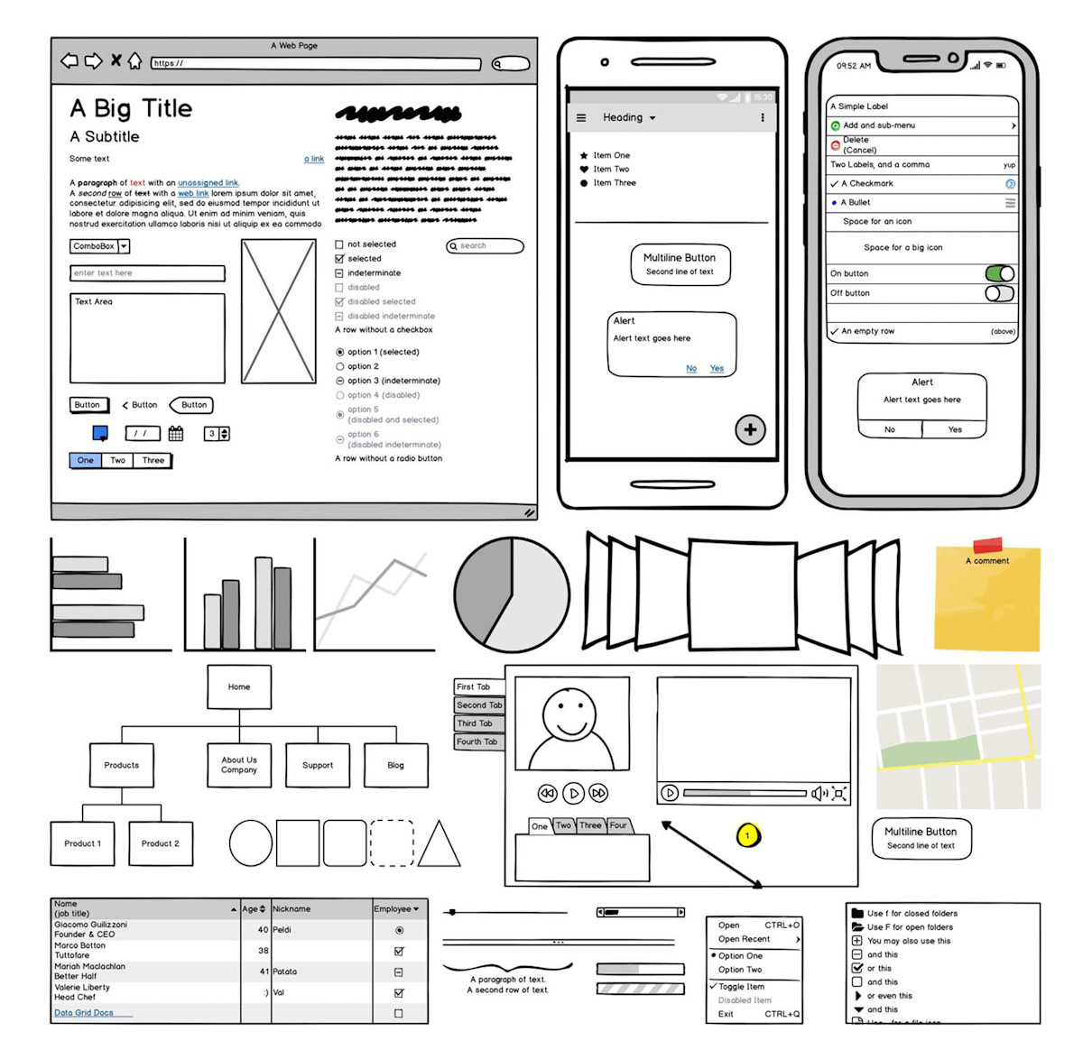
Figure 2: A basic wireframe created by using Balsamiq (Source: balsamiq.com)
Wireframes and the design process
Wireframes are created early in the design process before designers start thinking about an interface’s visual elements. This allows designers to make significant changes early on in the process and not later when the design is close to being finalised.

Figure 3: Wireframes and the design process
How does a wireframe look?
Wireframes should be kept simple and to the point, as the essential purpose is not to communicate the site’s visual characteristics but instead the structure and layout of the interface. Wireframes are a simple representation of a design, and as such, normally consist of black, white and grey basic layout designs. For example, a block with a cross can show image placement, and grey lines can represent written text.

Figure 4: Wireframe elements
Types of wireframes
There are three different types of wireframes:
-
Low-fidelity.
-
Mid-fidelity.
-
High-fidelity.
The difference between these three types is mainly based on each type of wireframe’s level of detail.
Low-fidelity wireframes
Low-fidelity wireframes can be seen as the starting blocks of the design process. The designer takes an idea and sketches it out to see if it makes sense and works for the client. Low-fidelity wireframes don’t have to be perfect; they only need to communicate the concept.
Another thing that makes low fidelity wireframes so useful is that it creates conversations around the overall layout, the navigation of the interface and outlining the user’s flow.
Figure 5: An example of low-fidelity wireframes (Source: uxdesign.cc)
Mid-fidelity wireframes
Mid-fidelity wireframes are a bit more detailed than low-fidelity wireframes but still reasonably simple. Mid-fidelity wireframes should show an exact, detailed representation of the overall layout of the website or app.
Designers can add text weights to highlight headings and paragraph text and boxes that represent images. It also assists in visualising the hierarchy of the elements in the design. Mid-fidelity wireframes are digitally created using tools such as Balsamiq and Figma.
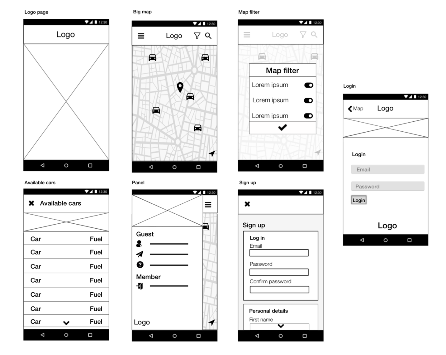
Figure 6: A mid-fidelity wireframe of the Emov app (Source: medium.com)
High-fidelity wireframes
High-fidelity wireframes should communicate the interface’s look and feel. These wireframes are only employed much later in the design process when each page’s structure and layout has been decided. At this stage, the user flow and information architecture of the interface have already been determined.
Here placeholder text like Lorem Ipsum is replaced with relevant written content, and instead of a box indicating an image, real images are used. Other visual elements such as colour, typography and the company’s branding elements are also added.
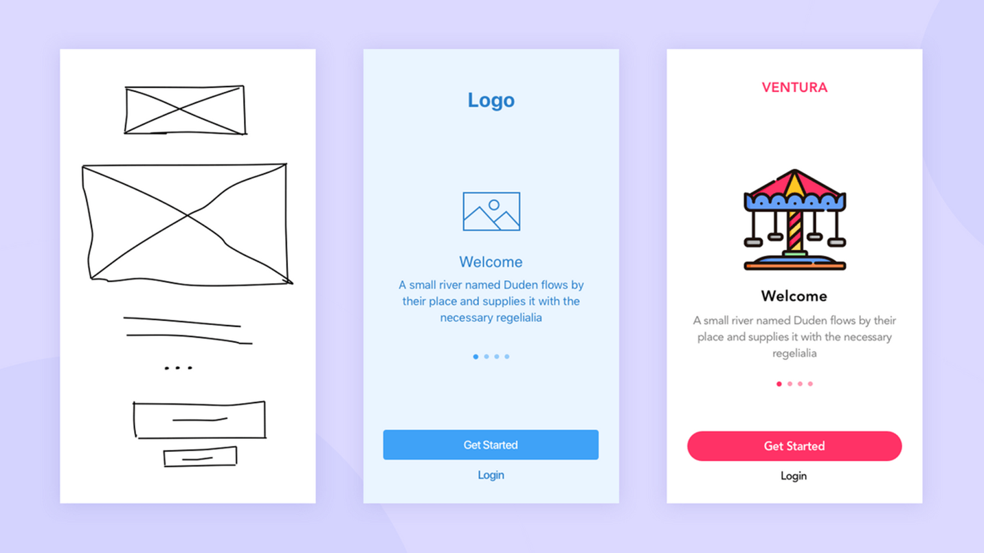
Figure 7: An example of low-fidelity, medium-fidelity and high-fidelity wireframes
Advantages
There are five advantages of wireframing:
Clarity
Wireframes bring transparency to interface design. It allows designers to think clearly about the site’s interactions and layout needs and assist them in coming up with solutions to problems.
Keep the client’s attention
Wireframes are an excellent tool to get the client to focus on the site’s structure, layout and functionality. Because of its simplicity, the client will not be bothered by other elements such as colour and images. These elements are reserved for later in the design process.
Communication to the team
A well-designed wireframe can communicate your creative ideas to the team. It also serves as a useful brainstorming tool between designers and developers, and other stakeholders.
Feedback
Wireframes allow for feedback from the client and team members. It also ensures that the primary message of a website is effectively delivered.
Responsiveness
A good wireframe can give developers a clear idea of what elements should be coded, how the overall layout needs to adjust from big screens to smaller screens, what content is essential, how developers should implement the overall hierarchy and if navigation on smaller screens is sufficient.
Activities
Activity 1
WATCH
Video: What are Wireframes - Balsamiq Wireframing Academy (4m 17s)
Activity 2
WATCH
Video: Wireframing best practices (5m 57s)
Activity 3
WATCH
Video: Tips on Sketching Your Wireframes (4m 45s)
Activity 4
WATCH
Video: How to wireframe a website (13m 50s)
Activity 5
READ
Article: Website and App wireframes for creating a solid UX Design
Lesson Task
Brief
For this lesson task, you will be designing low fidelity wireframes for a fitness app called ‘Fit for Life’. Fit for Life specialises in providing users with exercise routines, tips on cooking healthy meals and connecting them with an online community with similar goals. The target audience is aged between 20 and 40 and is serious about fitness and healthy living.
The different exercise routines can be broken down into the following categories:
-
Building muscle.
-
Fat loss.
-
Triathlon training.
Users should sign up and buy any exercise routine that fits their fitness goals. Users also get a free diet plan when they join.
Level 1 Process
-
Start thinking about the structure of the wireframe. What will fulfil the user’s need? Make a list of essential points that should be included. Things like purchase info, bonus info, join now CTA and so forth.
-
Get a paper and pen and start drawing your low fidelity prototype.
-
Don’t stick to one wireframe. Explore ideas and think of creative ways to structure your pages. Try to come up with three different approaches.
-
Make sure your wireframe is suitable for both desktop and mobile devices.