Introduction
Every second we see thousands of colours. Colours are everywhere and even though, according to experts, we can distinguish close to 10 million different colours, we can only name a small part of all colours we can see. In this lesson, we will look at the fundamentals of colour. We will look at how the colour wheel works and how the user experiences colour.
NOTE: This lesson contains 4 activities that you should complete.
Colour in design
Colour is one of the most difficult subjects in design. The difficulty is that colour is highly subjective – the combinations, harmonies, or discordance (clashes) that develop are subject to the viewers’ personal experiences and preferences. Colour tastes and meanings also vary across cultures and countries. Therefore, one single formula for effective colour-use does not exist – each new project that a designer encounters deals with decisions on colour for that project, task, and target audience.
Although the choice of colours is perhaps subjective and based on our personal experiences, it is important to understand the basic principles of colour theory and how colour works.
For our purposes, we will focus on colour theory as an aid to create aesthetic designs and to express a message visually. As designers, we study colour for two main reasons: To communicate the chosen colours to other designers using the colour system and to gain knowledge in how to apply colour.
Communicating about colour becomes important in design, as the mere words “blue”, “green”, “red” and others are not sufficient. When speaking of “blue”, do we mean blue as the ocean or blue as the sky? It becomes even more explicit when dealing with printed material and front-end development.
Every corporate identity has its own colour combination, and this must be applied uniformly across all elements, consistently. To achieve this, we need to be able to code and standardize colours. Pantone is an example of such a colour-code; printers and designers use it to determine which exact colour to use. Pantone also provides a standard to measure colours from. In web development, colours may be specified as an RGB (sRGB) triplet or in hexadecimal (HEX) code. Later in these lessons, we will learn and explore more about how the hexadecimal colour model works.
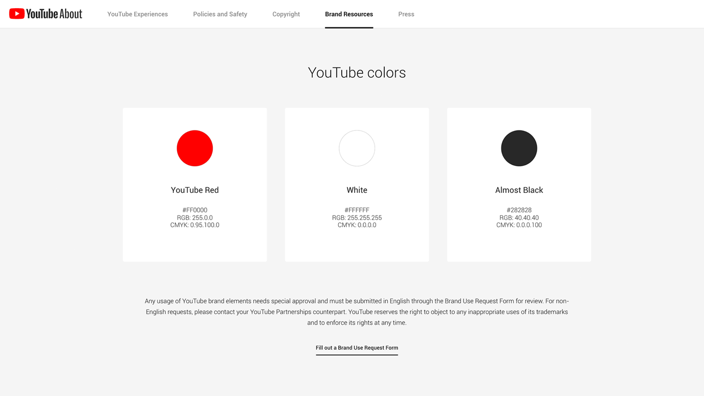
Figure 1. YouTube colours (youtube.com, 2020)
The basic principles of colour theory
Colour is the perceptual characteristic of light described by a colour name. Specifically, colour is light, and light is composed of many colours - those we see are the colours of the visual spectrum: red, orange, yellow, green, blue, and violet. Objects absorb certain wavelengths and reflect others back to the viewer. We perceive these wavelengths as colour.
In the visual arts, colour theory forms a practical guide to colour mixing. In addition to this, it focuses on the impacts of specific colour combinations. There are also definitions (or categories) of colours based on the colour wheel: Primary colours, Secondary colours and Tertiary colours.
Describing colour
Unfortunately, many different colour-coding systems use different terminology when describing colour, and others go into more detail; defining individual characteristics. For our purposes, we will stick to the very basics and work from there. Thus, you may encounter different terms in other references, but they all aim to differentiate the same fundamental thing.
A colour is described in three ways:
-
By its name (hue)
-
How pure or unsaturated it is (saturation)
-
Its value or brightness (intensity)
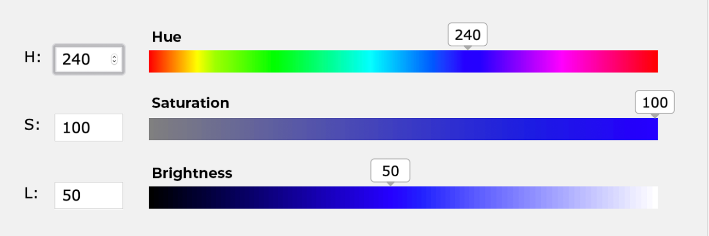
Figure 2. An example of hue, saturation and brightness.
Although pink, crimson, and brick are all variations of the colour red, each hue is distinct and differentiated by its hue, saturation and brightness.
Hue, saturation, and brightness
Hue, saturation, and brightness (HSB, sometimes called HSV) are aspects of colour in the red (R), green (G), and blue (B) scheme. All possible colours can be specified according to hue, saturation, and brightness, just as colours can be represented in terms of the R, G, and B components.
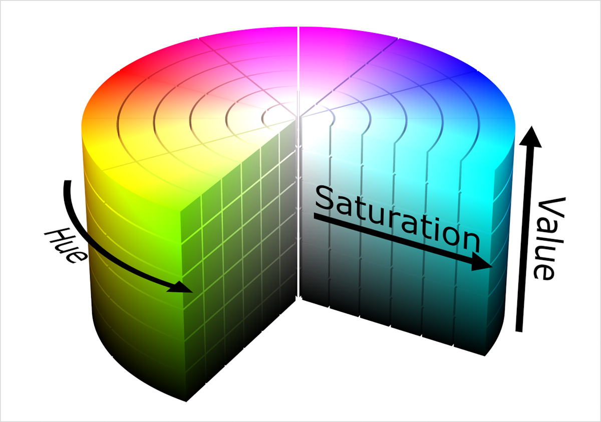
Figure 3. The HSB colour cylinder (Wikimedia, 2015)
Hue
The pure colours are called hues, but there are, of course, many more colours visible to the human eye. We do not have a name for every exact colour in our daily language - it would be impossible to give exact names to a million different colours. Therefore, we speak of pure hues, and then mixes of these (which can be hues in their own right) and then we break it down deeper into further hues.
For example, blue is a pure hue (we give it the name “blue”). Now we add a little bit of white and red to it and it is still seen as blue, but not exactly the same – it is a colour in its own right. We call it lilac-blue. Now we add a little more red to it and, since this exact colour doesn’t have a distinct name, we refer to it as a hue of blue; or a hue of the hue blue, if you like.
Saturation (a.k.a. chroma)
The degree of purity of a hue. Saturation is defined as the “colourfulness of an area judged in proportion to its brightness”. It controls the intensity of a colour, from vivid at 100% to grey or white at 0%.
Value (a.k.a. brightness, lightness/ luminance)
A measure of the amount of light reflected from a hue. Hues with a high content of white have a higher luminance or value. Goes from bright colour or white at 100% to black at 0%.
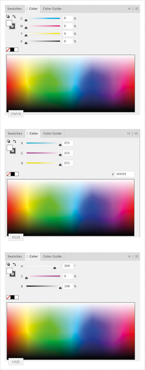
Figure 4. The CMYK, RGB and HSB Lab colour models in Illustrator CC 2020. They appear in the same way in Photoshop and other graphic programs.
Colour systems
Available colour systems are dependent on the medium with which a designer is working. When painting, an artist has a variety of paints to choose from.
-
Mixed colours are achieved through the subtractive colour method.
-
When a designer or front-end developer generates digital products and solutions on the computer, colours are achieved through the additive (RGB) colour method.
-
When we mix colours for the printing process, we use the subtractive (CMYK) colour system.
Subtractive colour and the CMYK system
When we mix colours using paint, or through the printing process, we are using the subtractive colour method. Subtractive colour mixing means that one begins with white and ends with black. As colour is added, the result grows darker and tends toward black. It also means that colour is created by the effect of light reflecting from a surface. In design, we often speak of the CMYK system:
C = Cyan (a distinct blue)
M = Magenta (a distinct hue of red)
Y = Yellow
K = Black / key
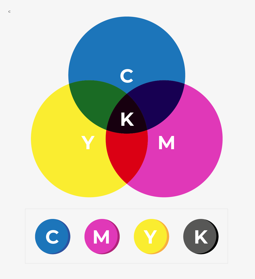
Figure 5. Subtractive (CMYK) colour method.
Theoretically, we should get black when we mix all these colours. However, in reality we get a murky dark colour. Black is mixed as a colour of its own – separate from the others. The K stands for “key”, as this is the key, or main plate, others align to in printing.
Additive colour and the RGB system
When we work on a computer, the colours we see on the screen are created with light using the additive colour method. Additive colour mixing begins with black and ends with white – as more colour is added, the result gets lighter, and tends toward white. It also means that colour is created by the effect of light moving directly into the eye.
The R = Red, G = Green and B = Blue colours are light primaries and colours are created with light.
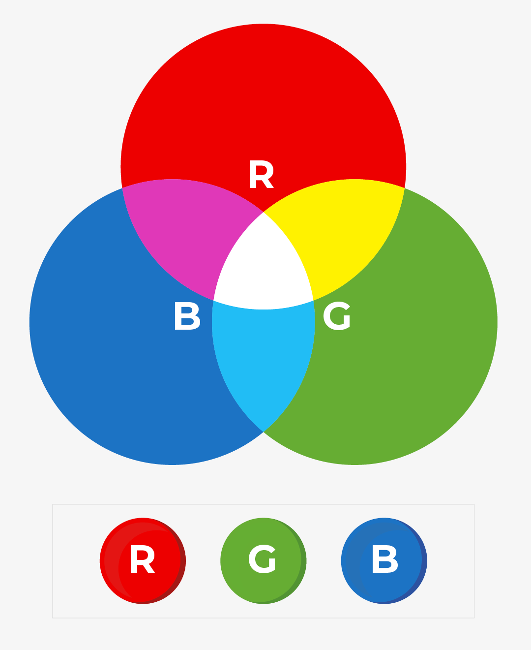
Figure 6. Addictive (RGB) colour method.
Working with the colour systems
There is a difference between additive colour and subtractive colour:
-
The colour produced in the additive system appears brighter.
-
The visible range in the additive system is wider – thus, more colours can be created in the additive than in the subtractive system.
The visible spectrum consists of billions of colours. A monitor can display millions of colours, but a high-quality printer is only capable of producing thousands. Older computer systems may be limited to 216 cross-platform colours.
Colour gamut - RGB colours to CMYK colours
Colour gamut is the entire range of colours and tones achievable by an imaging system.
Reproducing colour can be problematic in terms of printed and digital media; what we see on a monitor cannot be printed. Although a monitor may be able to display “true colour” (16,000,000 colours), millions of these colours are outside of the spectrum available to printers. Since digital designs are generated using the RGB colour system, colours used in those designs must be part of the CMYK spectrum or they will not be reproduced with proper colour rendering. Working within the CMYK colour system, or choosing colours from Pantone© palettes, ensures proper colour rendering.
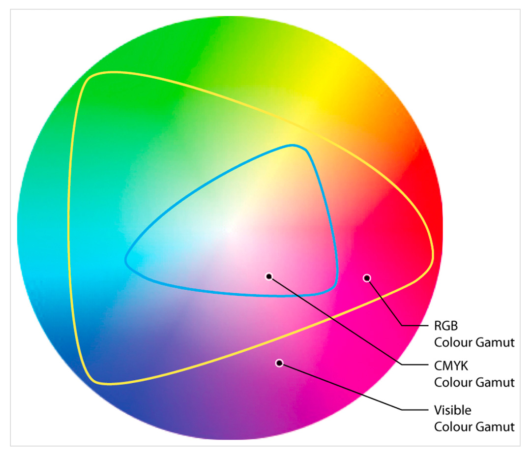
Figure 7. Colour gamut (myworldofcolour.wordpress.com, 2010)
The colour wheel
A colour wheel (also referred to as a colour circle) is a visual representation of colours, arranged according to their colour relationship. Begin a colour wheel by positioning primary hues (the main colours from which others are created – red, yellow and blue) at equal distances from one another, and then create a bridge between primaries using secondary and tertiary colours.
Figure 8. The colour wheel.
Primary Colours
As the name suggests, primary colours are the main colours at the top. These can be seen as the parents of all the other colour combinations. They are the foundation of every other colour and can create millions of colours by mixing the three primary pigments which are yellow, red, and blue.
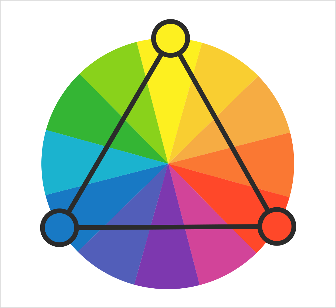
Figure 9. Primary colours.
Secondary Colour
They can be seen as the children of the primary colours and consist of green, orange and purple. In colour theory when we mix yellow and red it becomes orange. Red and blue becomes purple and blue and yellow becomes green. The end result of mixing the primary colours are then called secondary colours.
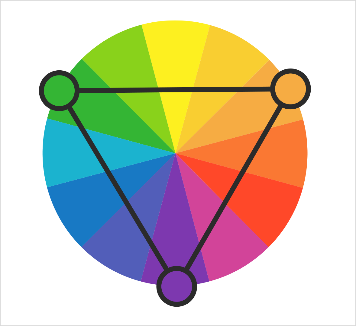
Figure 10. Secondary colours.
Tertiary Colours
Tertiary colours are the colours in between the primary and secondary colours and can be seen as the grandchildren of the three primary colours. They consist of yellow/orange, red/orange, red/purple, blue/purple, blue/green and yellow/green.
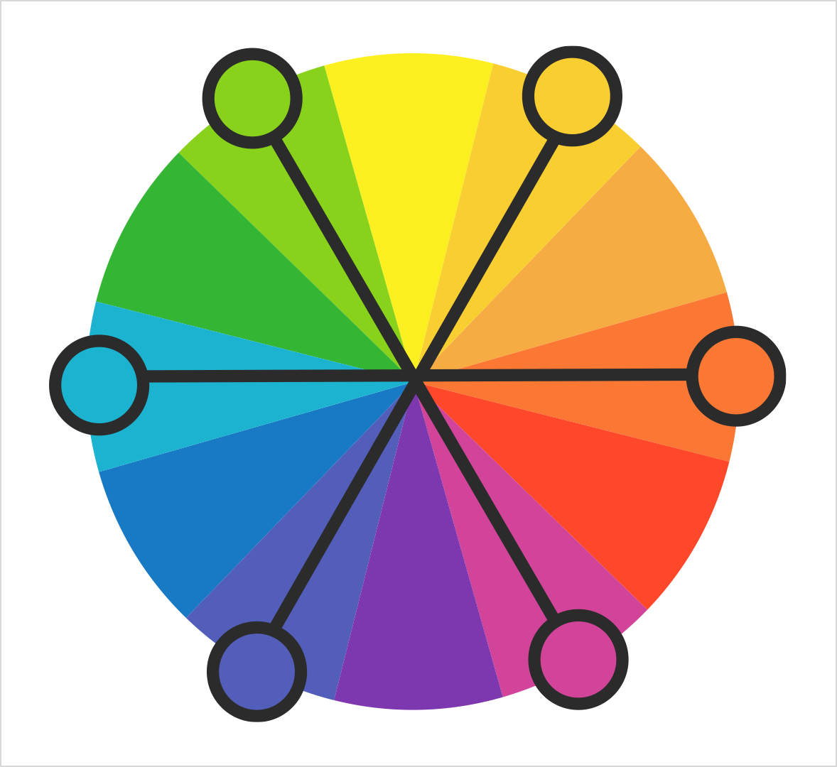
Figure 11. Tertiary colours.
Complementary Colour
These are located opposite one another on a colour wheel. To call those hues that are directly opposite one another “complements of each other” is correct. Complementary colours bring out the best in each other.
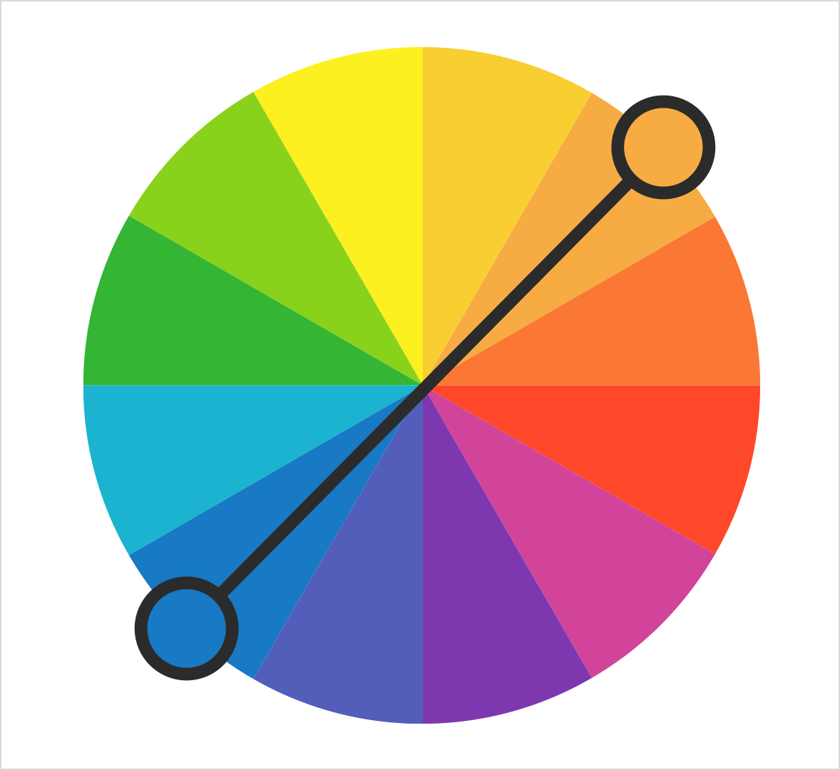
Figure 12. Complementary colours.
When fully saturated complements are brought together, interesting effects are noticeable. This may be a desirable illusion, or a problem if you are creating visuals that needs to be read.
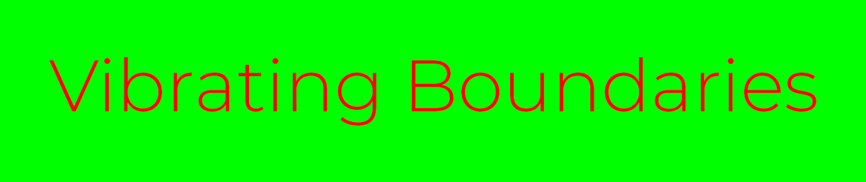
Figure 13. A problem occurs when reading the red text on the green background.
Analogous colours
Analogous colours are colours located close together on a colour wheel.
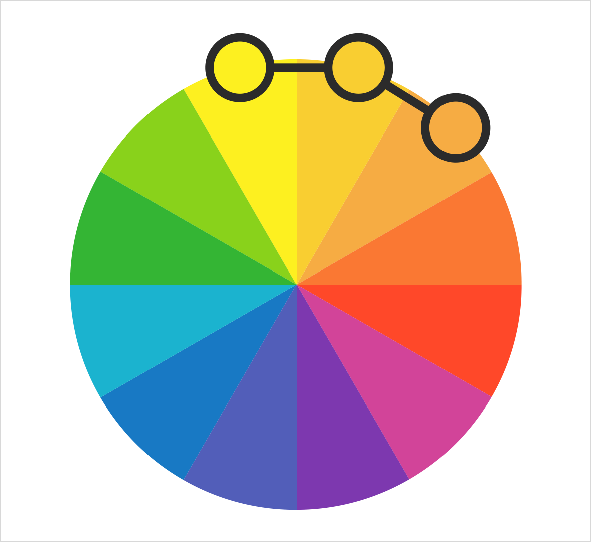
Figure 14. Analogous colours.
Colour Ranges
A colour wheel can be divided into ranges that are visually active or passive. Active colours will seem to advance (pop) when placed against passive hues. Passive colours seem to recede (fade) when positioned against active hues. This becomes important when dealing with the interaction of colours.
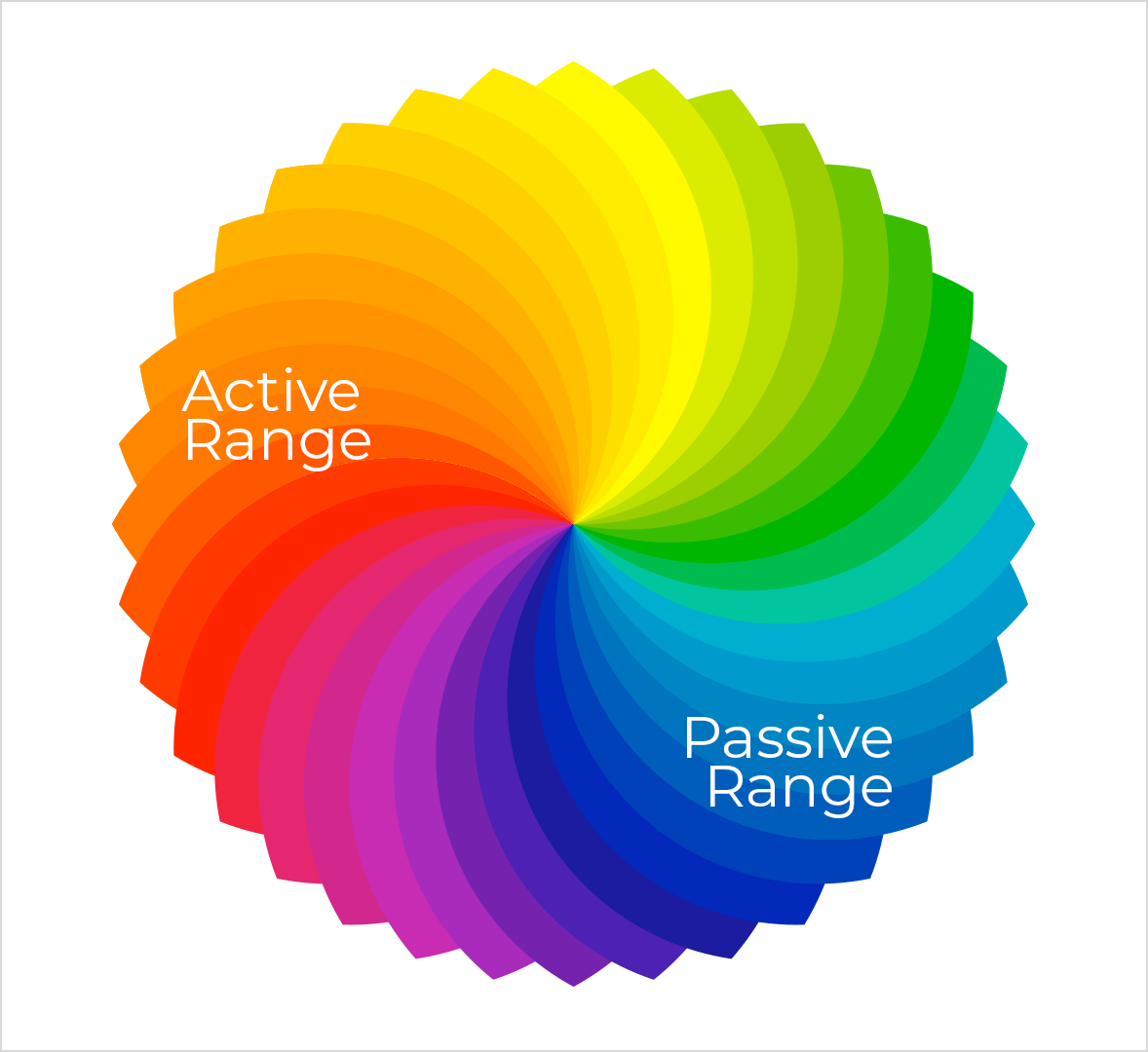
Figure 15. Passive and active colours.
-
Advancing hues are often thought to have less visual weight than receding hues.
-
Warm, saturated, light value hues are “active” and seem to visually advance.
-
Cool, low saturated, dark value hues are “passive” and seem to visually recede.
-
Tints or hues with a low saturation appear lighter than shades or highly saturated colours.
-
Some colours remain visually neutral or indifferent.
Colour Combination
Colour combinations may pass unnoticed when they are pleasing to the eye – yet they offend dramatically when the compositions clash. One outcome we seek in the final form or composition of a design is a successful use of colour.
We determine whether or not our colour usage is successful by critically assessing the visual balance and harmony of the final composition. Balance and harmony are achieved by the visual contrast that exists between colour combinations. When planning a successful colour combination, we need to first investigate and understand colour relationships.
Using a colour wheel and a template, the relationships between colours are easy to identify:
Figure 16. Complementary colours.
Colour and contrast
Every visual presentation involves figure-ground relationships. This relationship between a subject (or figure) and its surrounding field (ground) will display a level of contrast; the more an object contrasts with its surroundings, the more visible it becomes.
When creating designs that are intended to be read, it is important to offer the viewer enough contrast between the background (paper or screen) and the text. Text presentations ideally offer at least an 80% contrast between figure and ground. (Black text on a white background is ideal.) If there is not enough contrast between figure and ground, the viewer will squint to view the text – causing their eyes to get tired.
Yellow text on a white background or blue text on a black background is difficult to read due to the low level of contrast between figure and ground.
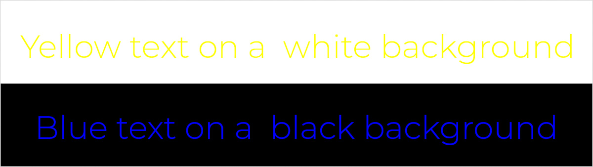
Figure 17. Difficult to read text due to the low level of contrast between figure and ground.
An occurrence known as “simultaneous contrast” (or chromo stereopsis) may happen when opposing colours are placed in close proximity to each other. Text may appear to vibrate or may seem to cast a shadow. Eyestrain and fatigue will result if a viewer focuses on a document displaying similar properties for a long period of time.
Some colour combinations, such as red text on a blue background, cause illusions when positioned together.

Figure 18. Red text on a blue background.
Colours, associations and emotions
It is good to have some knowledge in understanding the different emotional attributes the main colour groups can bring to a design. The main colours are: Red, Orange, Yellow, Green, Blue, Purple, White and Black.
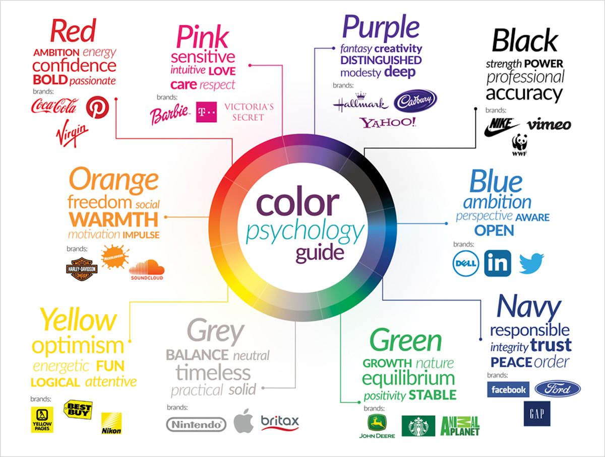
Figure 19. Color psychology guide (Decary, 2019)
Red
Red is a rich, exciting, dramatic colour. It also has the feeling of affection and passion, as it is, for example, often used for Valentine’s Day.
Red is also often used in food, wine and beverage websites due to its indulgent feeling.
Red is a warm, brighter colour and can make a user more alert since it attracts attention and creates energy.
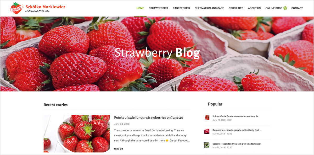
Figure 20. An example of red used on a lifestyle blog (Markiewicz, 2018)
Orange
Orange has a feeling of energy, enthusiasm, creativity.
Orange is a stand-out colour in real life, often used for high visibility objects such as life jackets and road cones.
Orange is also a warm and versatile colour. It can be energizing, but a lighter orange can be unobtrusive.
Orange can stimulate metabolism and appetite as well.

Figure 21. A good example of orange being used on (fixate.it, 2022)
Yellow
Yellow is associated with happiness.
Yellow is a visible colour used to highlight. For example, it is used for taxi cabs and caution signs.
Yellow is also an energetic colour without the extreme of red.
However, too much yellow can be overpowering.
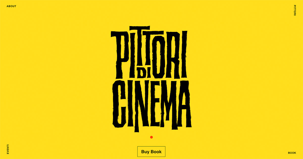
Figure 22. A good example of yellow being used on website (pittoridicinema, 2020)
Green
-
Green has a feeling of growth and freshness.
-
It is a colour often used with nature and environmental websites.
-
Green is in between a warm and cool colour, although leaning more towards the cools.
-
Green is easier on the eyes, compared to red and yellow, creating a relaxing, soothing feel.
-
Green can also represent stability.

Figure 23. Green on a website creating a feeling of growth and freshness (fiverr.com, 2020)
Blue
-
Blue is associated with calmness and has a relaxing and safe feel.
-
Two popular social media sites use this colour - Twitter and Facebook.
-
Blue is not often found in foods - it reduces appetite.
-
Blue also promotes Intelligence, reliability, and stability.
-
Blue is found in the sea and the sky and gives a sense of ease, so it is a colour often found in airline and cruise websites.
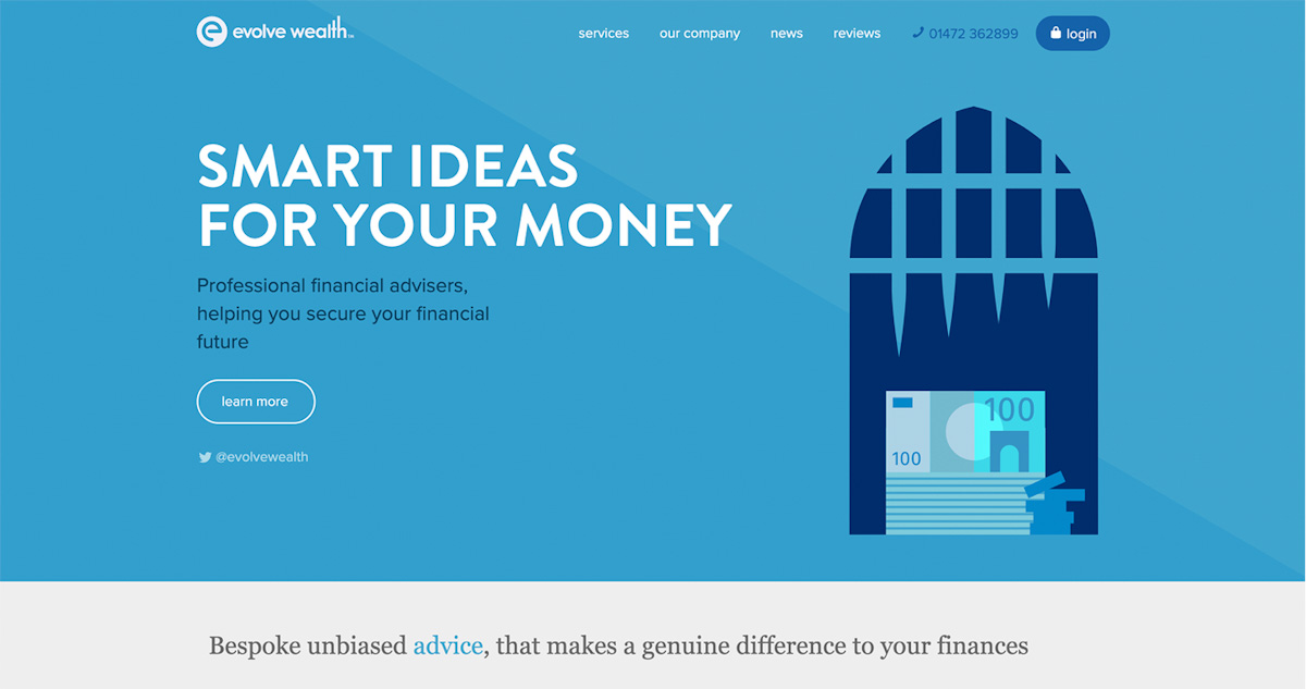
Figure 24. Blue promotes reliability and stability (evolvewealth.co.uk, 2019)
Purple
-
Purple is associated with luxury and power.
-
This colour is also linked with mystery and magic.
-
Purple is historically linked to royalty, for example as used in coat of arms in stamps.
-
Purple is not often used in websites. But if used correctly, it can create a lavish and indulgent feel.
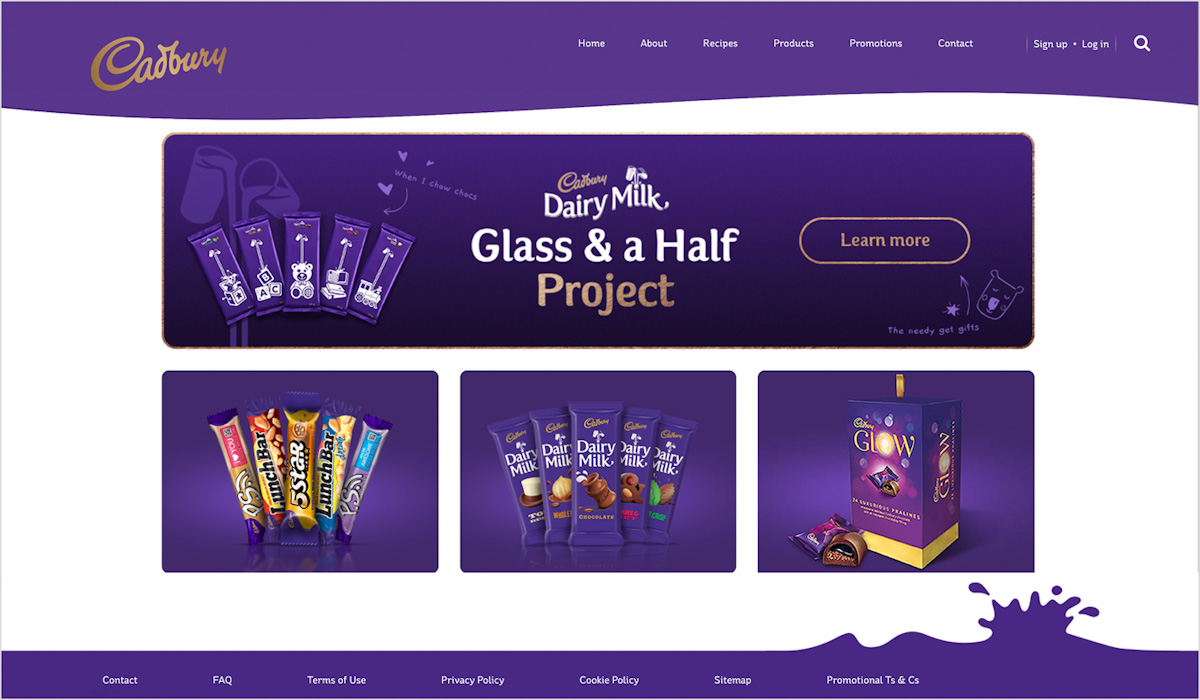
Figure 25. Purple to create a lavish and indulgent feel (cadbury.co.za, 2020)
White
-
White has an association of light, cleanliness, and simplicity.
-
White is mostly linked to innocence and purity in the western cultures; for example, white used for wedding dresses. In the Eastern culture, the colour is associated with mourning.
-
White is often used as a background in minimalistic websites. It is great to use when you want to draw attention to other elements/colours on the page. For example, in art websites when you want the user to focus on artwork.
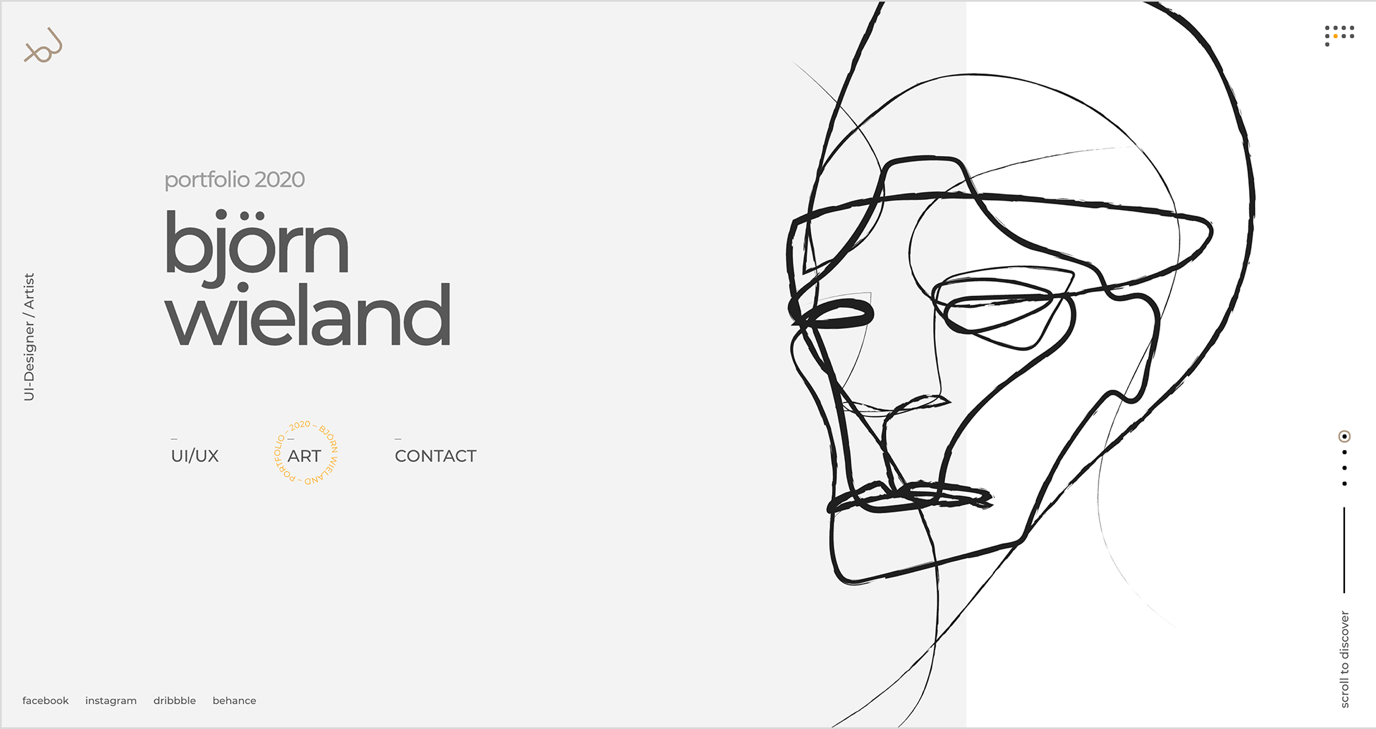
Figure 26. White is often used in minimalistic websites (Wieland, 2020)
Black
-
Black can be associated with elegance and power.
-
Black is the strongest of the neutral colours and is used in many websites, often as the text colour, although it can be used as the main strong colour of the site.
-
Black is also linked to evil and edginess.
-
It is also often used to give a feeling of sophistication.
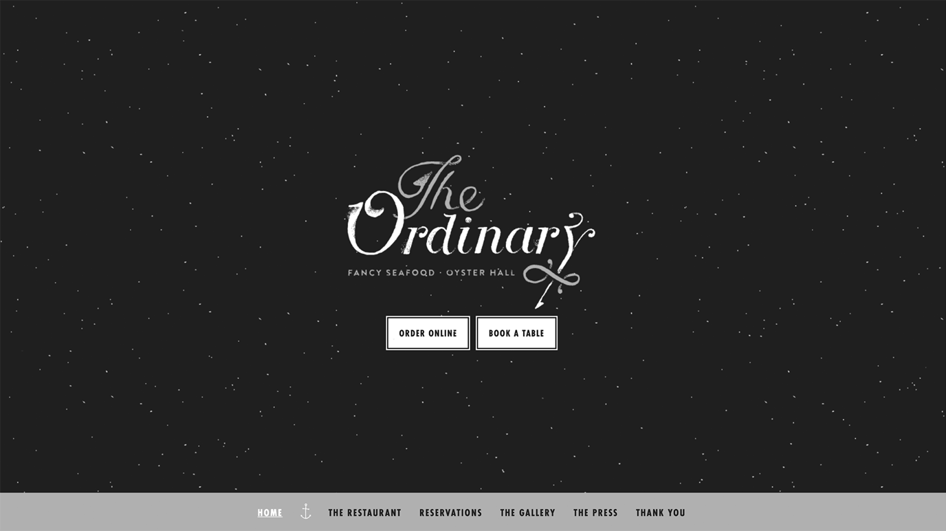
Figure 27. Black is often associated with elegance and a feeling of sophistication (eattheordinary.com, 2020)
Activities
Activity 1
READ
To understand more on reproducing and managing colour across different media. It is a common and frustrating issue, so ensure that you understand the differences between CMYK, RGB, and sRGB.
From David Kadavy’s book Design for Hackers: Section: ‘Colour Models in Action: Why Your Business Card Doesn’t (and Never Will) Match Your Website’ (pages 225-233) (1h)
Activity 2
READ
When designing for web, there are already some established standards and patterns for the choice of colour. It´s good to know them.
From David Kadavy’s book Design for Hackers: Section: ‘Colour Choices and Web Conventions’ (pages 249-255) (1h)
Activity 3
WATCH
Adobe Colour is an excellent online tool to create colour palettes. Watch the following video from LinkedIn Learningas a short introduction to Adobe Color. Remember to be logged in to your Noroff account. Video Course: Adobe Color Essential Training (2h 35s) by Bart Van de Wiele.
This video shows you how to set colour styles in Figma. Video: Creating colour styles
Another alternative to use for Figma is Coolors
Activity 4
READ
Article: A Quick Look at Types of Grids for Creating Professional Designs by Adriana Marinica.
Lesson Task
Goal
Create a colour palette from a photograph of your choice by using Adobe Colour.
Brief
Choosing the right colours for your website is not always easy. Humans can see approximately 10 million colours which it does not make it easier to choose the right ones in the right combinations. Fortunately, there are some easy techniques that can help in the colour picking process. Using photography can be a good starting point to find inspiration to create a more interesting colour palette. It can be a handy solution when you are out of ideas for new colour palettes and colour combinations.
Your task is to create one colour palette with Adobe Color CC or Coolors from any photograph of your choice.
NOTE: It’s important to watch the video specified in ‘Activity 3’ before attempting this task.
Level 1 Process
-
Choose one colour photograph of your choice. Make sure the image is of high quality.
-
Upload the image in Adobe Color CC (color.adobe.com).
-
Create a new colour palette with Adobe Color CC. Try to manipulate the colours so that you are able to create a more interesting result.
-
Save your colour palette in a new library.
Bibliography
Munsell, A. H. (2007). Munsell-system. Retrieved July 2020, from Wikimedia Commons: https://commons.wikimedia.org/wiki/File:Munsell-system.svg#/media/File:Munsell-system.svg
Wikimedia, c. (2015). HSV color solid cylinder. Retrieved July 2020, from Wikimedia Commons: https://commons.wikimedia.org/wiki/File:HSV_color_solid_cylinder.png
myworldofcolour.wordpress.com. (2010). The Characteristics of Colour. Retrieved July 2020, from My World of Colour: https://myworldofcolour.wordpress.com/tag/color-gamut/
Decary, C. (2019). How to choose your brand colours. Retrieved July 2020, from parallelbranding.com: http://parallelbranding.com/brand-colors/
Distributors, N. H. (2017). New Hampshire’s Choice for Quality Beverages. Retrieved July 2020, from New Hampshire Distributors: https://nhdist.com/
Markiewicz, S. (2018). Strawberry Blog. Retrieved July 2020, from Szkólka Markiewicz: https://www.truskawka.pl/
wix.com. (2020). The Leader in Website Creation. Retrieved July 2020, from wix.com
pittoridicinema. (2020). Pittoridi Cinema. Retrieved July 2020, from pittoridicinema: https://www.pittoridicinema.it/
fiverr.com. (2020). Find the perfect freelance services for your business. Retrieved July 2020, from fiverr.com: https://www.fiverr.com/
evolvewealth.co.uk. (2019). Smart ideas for your money. Retrieved July 2020, from Evolve Wealth: https://evolvewealth.co.uk/
cadbury.co.za. (2020). Glass and a Half Project. Retrieved July 2020, from Cadbury: https://www.cadbury.co.za/
Wieland, B. (2020). Portfolio 2020 Björn Wieland. Retrieved July 2020, from Björn Wieland: https://bjoernwieland.com/
youtube.com. (2020). Brand Resources. Retrieved July 2020, from YouTube: https://www.youtube.com/intl/en-GB/about/brand-resources/#logos-icons-colors
eattheordinary.com. (2020). The Ordinary. Retrieved July 2020, from Eat the ordinary: https://eattheordinary.com/