Introduction
This lesson contains 2 activities that you should complete as you go through it.
It’s time now to take the principles we’ve been learning about and start integrating them into practical solutions on the page. We must also ensure that our design takes what we understand about the user and their goals and allow that to influence everything from our color choices to our navigation.
While technologies might change over time and we use new ways to help the user achieve goals, we must stay true to the principles we’ve discussed so far. Whatever the website might be, it must be clear in its purpose, easy to understand and navigate, and invite the user to interact with it.
Every project will require different elements, layout, and style and when considering the interaction design, we must be true to the context and goals of the users.
Elements
Size
We should chose the size of elements based on their importance to the goals of the user. Sometimes you’ll have two very different users on a site.
For example, Uber have two very different clients with different needs. You can see from their home page that they’ve given equal size to both parties. Interestingly, the clients appear at the top of the list but the drivers have their sign up form already opened.
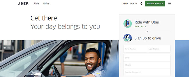
Screenshot of Uber’s home page. https://www.uber.com
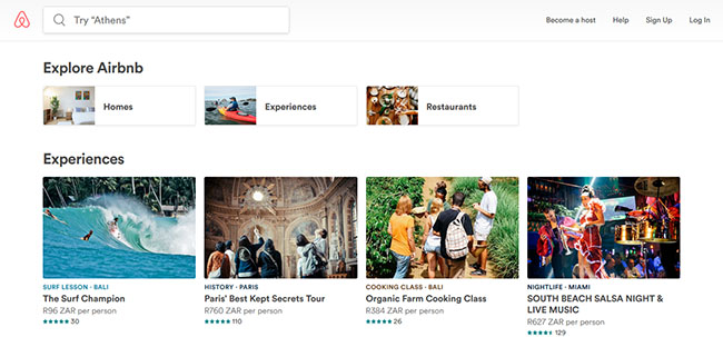
Compare that to Airbnb, who also have two users to support, but have clearly chosen to focus on their primary user who is the client, and secondarily on the host. ‘Become a host’ is first in the menu on the right, but it pales in comparison to the large images about ‘experiences’ and the search bar in the top left of the screen.
Color
Color is a very obvious tool for interaction designers. Primary call-to-action buttons should be bright and engaging, whereas secondary navigation or elements that will only be important to a smaller percentage of users should be less bright and imposing. Careful use of color is a great way to help your visual hierarchy.
Color can also be helpful for feedback. Green means go, and red means stop. Use green to move users forward and red to alert them to problems. There’s no need to try and re-create color associations, but utilise people’s innate understanding of what colors mean and their emotional reactions to those colors.
Flat Design
It’s important to be aware of the advantages and pitfalls of flat design when deciding on how to create interactions. It all depends on your context and users about whether to choose cleaner lines with less affordances, or utilise skeuomorphism to clearly guide clients with your elements.
Typography and Text
Make sure that your paragraphs are not too wide. Users struggle to read long sentences of text. Ensure you break long paragraphs into manageable chunks. Less text allows users to scan more easily. Remember that users have limited attention spans and if they can’t easily read or engage with the text, they will bounce.
The same is true for your typography choices. Ensure users can easily read the font and make the font-size big enough to read, but not too big that it becomes overwhelming. Font choices are site-specific, but generally sans serif fonts are easier for users to read on the web.
Make sure you keep all caps to only select headings or buttons. Users struggle to read long sentences in all caps. So again, you’re asking the user to make a reward vs effort analysis.
Navigation
Navigation has two important roles. One is to help the user get around the site and find the content or usability they’re looking for.
The other role is to help them know where they are, how to get back, or move forward. Users can land on any page from a search engine and their first goal is to find out if they’re on the right page. For example if you were looking for the book ‘Atonement’ and had clicked a link from a search engine, you’d probably check the navigation to check if you were in Books > Fiction or Movies > DVD to know if you were on the right page.
Primary and Secondary Navigation
Depending on how big the site is and how complex the content structure is, it might be important to split your navigation between primary and secondary navigation.
Primary navigation relates to the navigation that a user is most likely to be engaged with and interacting with. Secondary navigation is there to supplement the primary navigation with information the user is less likely to need, but offers a more balanced view of the site. Often secondary navigation contains things like ‘Contact Us’ or ‘About Us’.
Take a look at the navigation structure chosen by the following site. It’s an e-commerce site selling a variety of goods. Here they have three navigational tools. At the top is the high level navigation letting you ‘Sign in / Register’ etc. Then below that is the primary navigation where the user is most likely going to use to get around the site, then on the left is a sidebar navigation that allows the user to drilldown for greater clarity on their results.
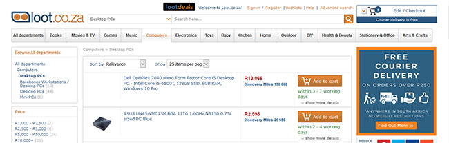
Screenshot from Loot.co.za
This type of layout is fairly standard across e-commerce sites and lets the user easily navigate between the sections on the site. Remember some users are looking to browse around and might be interested in a variety of products, while some want something specific and want the ability to narrow their results to find exactly what they’re looking for.
Horizontal vs Vertical Menus
The decision of whether to make the menu horizontal or vertical is usually down to the number of categories and sub-categories the site will have. Horizontal menus work better for sites with fewer main categories, wheras vertical menus allow more space and therefore suit more main categories.
Dropdown and Flyout Menus
If you want to use a horizontal menu structure, you can use dropdown menus, but be wary of hiding important sub-categories under a dropdown. Remember the user only knows about the content they can see.
The other major consideration of that if your dropdown menu’s sub-categories reveal further levels in the menu, they need to be coded with a delay to allow the user time to move their mouse from being on the one level and move to the next.
If there are a large number of sub-categories on the dropdown, it’s useful to ensure to make further sub-categories so that users can focus their attention.
Landing Pages
Most of a site’s traffic is likely to come from search engines and therefore it is important to optimise landing pages. In order to optimise landing pages, the site should be clear about what it is about, where the user is, and what to do next. You should use things like sub-headings, images, taglines, a logo etc. to help users orientate themselves as quickly as possible.
A user can land on almost any page; although some pages are more likely than others.
Category Pages
Category pages are popular landing pages because they focus the user’s search. If the website is an online hardware store, it’s likely that they will receive more traffic for pages such as ‘Cordless Drills’ or ‘Ladders’ rather than product names like ‘Ryobi P1811’.
These category pages must be optimised to get users browsing and for appearing higher in SERPs. They will often contain a heading with a short blurb about that particular category. This is both for SEO and for helping the user further orientate themselves.
The user is usually there to engage with the content in the category pages, and so this section should be well thought out.
Content Pages
The content pages themselves will also function as landing pages even though they will receive less cumulative visits than category pages. On an e-commerce site these pages will be the products, or on news sites or blogs it would be the articles.
Usually the content page will include things that help the user quickly get an understanding of the page and the content it contains. It’s helpful to have a bulleted list of what the page/product is about, and then include the full description or article below.
It is also useful to include sections on the page that can engage the user even if this particular page is not what they’re looking for. Include ‘Other people viewed’ sections to help users find other content on the site.
Home Page
Unless the website is particularly popular or especially niche, it is unlikely that most users will start off browsing on the home page.
Most users will head to the home page to either learn what the site is about and how it works, or to re-calibrate their navigation on the site. Therefore it is important that the home page answers these two questions:
About Site
You can use a brief description to explain what the site is about, but also don’t be afraid to show the user content. You might think that showing specific products might overwhelm users but sometimes it can help them get a clear idea of what the website has to offer.
How to Navigate
The home page should include main links that users are likely to need. Choose the most popular category pages and put them on the home page, or use a clear search section with examples if the best way to navigate the site is through searching.
On the home page for Rightmove.co.uk, although their main heading is a bit vague, they have a useful sub-heading in ‘Search properties for sale and to rent in the UK’ with a clear search bar and two equal buttons that force you down different paths in the site.
Below that they have a map search and ‘Featured content’ which indirectly helps the user understand more about what the page is about.
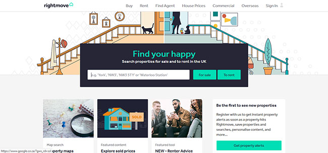
Screenshot of Rightmove.co.uk
The important thing with the home page is getting the users back into the flow on your site and exploring category and content pages. Don’t overwhelm the user with too much information about the website. Keep it simple.
Activities
💻 WATCH
📖 READ
From About Face: The Essentials of Interaction Design Paperback, 2014, by Alan Cooper et.al.
- Chapter 16: ‘Designing for Different Needs’ (1h)
- Chapter 17: ‘Integrating Visual Design’ (1h)
Lesson Task
Goal
Analyse how different sites use elements, navigation, and layout of landing pages and their home page depending on their user and their goals.
Brief
Go to a search engine and search for ‘linen’. Are the results mainly category pages, product pages or home pages? Open a few of them and spot similarities and differences between them. What helps orientate you quickly on the page and help know where you are and where to go next?
Level 1 Process
-
Search for ‘linen’ on a search engine.
-
Open the results from the first page.
-
Identify where in the site structure you are arriving. Is it on the home page, category page, or content page?
-
Analyse the elements on the page. What colors help communicate something about linen? What fonts do they use? What elements are larger on the page and command a greater position in the visual hierachy?
-
Examine the navigation. How do they let you know where you are? How do you find other categories on the site?
-
Analyse how the landing page communicates what it is about. Do they use headings and sub-headings? What images let you know where you are?
Time
1 hour