Introduction
This lesson contains 3 activities that you should complete as you go through it.
There is one common theme that will come up time and again during this course, and that is that good design is intuitive. Nobody has time to read a manual to try and figure out how things work. Things should just function as though the user has always used the product.
This lesson focuses on ways we can make our products more intuitive for our users.
Metaphors
Metaphors can be a very useful tool for designers and developers. They give users a starting point from which to come from. The metaphors need to be adapted for their contexts and shouldn’t be complicated.
Our interaction with computers is much more conceptual than physical. We move a mouse which in turn moves a small cursor on a screen. That cursor functions like our hand and even turns into a hand if we hover over a link. This line gets blurred with phones and tablets, where the interaction tends to be more physical but even then we understand we only see a graphical representation of our interaction.
Files and folders on our computer is another metaphorical way of understanding how a computer works to store information. It makes sense to us because that’s how we store other information. When we drag-and-drop files into the trash can it’s entirely metaphorical.
We understand and talk about a website as though it is a book or library when we “browse a site” or “view a page”. When we “surf the web” we’re actually using a double metaphor to say we are riding an ocean of content, and we’re also using an interconnected web of information and HTML documents.
We use metaphors to help us navigate. In Western cultures we understand that when clicking arrows to change images or content, that left means back and right means forward. We also use breadcrumbs to help us know where we are on the site and how to navigate upwards.
Metaphor has come under criticism in interaction design as you’ll read in ‘About Face’. One of the problems is when the designer decides to use metaphors that are not intuitive or widespread, it can be very confusing for the user. It’s very difficult getting a user to understand a whole new metaphor, especially if it’s central to your website or app. Be wary of over-extending metaphors, but leverage the understandings already created for users.
Another problem for metaphors is that they don’t age well. Look at the save button icon as a floppy disk. Almost nobody remembers floppy disks any more, but somehow it gets used as a metaphor for save. But even if they don’t age well, they are at least universally understood which is the most important thing.
Affordances and Signifiers
People are looking around trying to figure out how the world works. How do we know where to interact?
Affordances is a term coined by Don Norman and describes the relationship and opportunity for interaction between the user and the object. An affordance affords a certain action. A door affords opening, a chair affords sitting, a hat affords wearing, and a web form affords submitting.
To communicate that these affordances are there, Norman came up with another term called “signifiers” which let the user know that an affordance exists. On a door there is a handle, on a chair there is a flat surface and back support, on a hat there is a head-sized space, and on a web form there is a submit button that changes on hover.
Signifiers tend to be visual rather than auditory because of accessibility and also some users might have their sound turned off. This doesn’t mean the signifiers are never used, and often they’re used in operating systems to let us know if certain actions were completed or if there was an error.
Affordances are great when they work, but can be problematic when they don’t. Don Norman, in his book ‘Design of Everyday Things’, points out when doors have bad affordances and signifiers with bar handles being used for both pushing and pulling. This is bad interaction design because the user gets confused as they understand that a bar handle usually affords pulling, and plate affords pushing.
In the example below, do you push or pull? The same handles are on the other side as well, so you can’t know until you try.
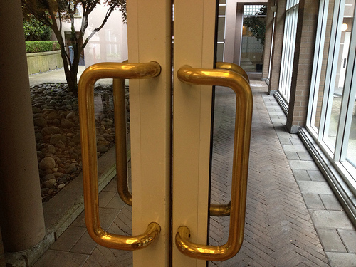
Alan Levine ‘Door of Zero Affordances’ https://www.flickr.com/photos/cogdog/7313104802
The user enters the interaction with preconceived ideas of what each object does and when it doesn’t perform as expected the user feels like it is their fault, and especially online, receives a terrible error message that doesn’t properly describe what went wrong and how to fix it. And even worse, it blames the user for the mistake when really it’s the designer’s fault.
To combat some bad design decisions, designers often rely on help text to explain what and how to do things. Unfortunately users don’t read instructions. They just do. And as discussed in our lesson on flow, we don’t want to make the user think.
Perceived affordances
Online things are a bit different to in the real world. On a computer a slider isn’t physical, but it’s styled as though it has physical properties. It has little dots on it that signify it can be pulled, just like a slider in the real world would have those same dots for grip.
Obviously on a computer, you don’t need grip but this perceived affordance helps the user know what to do.
Patterns
Across the web certain patterns have emerged that users intuitively understand and don’t require explicit explanation. Most users understand that a line of unrelated words at the top of the screen are likely to be the navigation and that hovering over them with the cursor is likely to drop down a further list of words.
Users have also begun to understand patterns that words on a solid background or in a rectangle are likely to be a clickable button. Or that clicking a ‘heart’ symbol on a product will save it to a wish list.
You need to analyse the users coming to your site in order to understand what patterns they have previously encountered, and where you need to be more explicit about how to interact.
Physicality
We can indicate an affordance through physically showing the user that they can interact. On a button you can use drop shadows, outlines, blurs etc. to indicate that the object is pressable. By making it seem 3D it stands out from the 2D screen as something we can interact with.
Some people argue that we can move on from using more obvious affordances where people are used to them because they already have a pattern affordance. It all depends on your user and how they will interpret the affordance. Some users don’t need to be lead and can enjoy a cleaner look, others need the physical affordance.
Language
Including words like ‘search’ or ‘click here’ can help a user know what to do. Their advantage is that they are explicit and clear for the user, but they can get redundant. You don’t want to say ‘click here’ for every link. If there is some physical affordance to the text, the user can figure out how to interact.
Metaphor
As discussed earlier, metaphor is an important tool for the interaction designer and can help the user understand what to do. If the user sees an envelope, they understand that they’re going to send a message.
Hidden
Some affordances are hidden from the user until they begin to get close. A good example of hidden affordance is an on hover state. As soon as the user mouses over a section of the page, they’re alerted to the fact that they can interact here.
On hover states can also be used to provide feedback to users that they can continue interacting. On a search field, you can make subtle color changes to the input field to tell the user that they can continue interact and type now that their click has selected that field.
Activities
💻 WATCH
📖 READ
📖 READ
From About Face: The Essentials of Interaction Design Paperback, 2014, by Alan Cooper et.al.
- Chapter 13: ‘Metaphors, Idioms, and Affordances’(2hr)
Lesson Task
Goal
To learn about spotting affordances and see how they guide users to take certain actions.
Brief
Go to Airbnb browse the site spotting where Airbnb are using various affordances to guide the user to take action.
-
Where have they used physical affordances to make certain items appear like they should be interacted with?
-
What pattern affordances have they used to leverage already standard design? Do they have opportunties to make the design less explicit and more intuitive?
-
Have they used hidden affordances to engage users or provide feedback?
-
What language affordances have they used? Do they rely on symbols or more explicit language?
Time
1 hour