Introduction
This lesson contains 2 activities that you should complete as you go through it.
Errors
No matter how intuitive you try to make your website or app, you will still get users causing errors, and it’s important to handle these well. Users get frustrated when errors occur and if we aren’t able to provide helpful feedback they might become anxious or disillusioned.
As far as is possible we should resolve errors, but we shouldn’t feel too bad about building error alerts into the system. Our users are human after all, and not all errors are caused by mistakes by the designer or developer. Sometimes mistakes just happen.
Types of Errors
Accidents
Accidents occur when the user knows what to do but makes an error by mistake. Typos are a great example of this. It’s useful to put in fail-safes for accidents to ensure that users don’t make mistakes.
MS Word handles typos well by simply underlining the text with red. It doesn’t force the user to take an action because of the typo because they aren’t always sure that an error has occurred.
Another example from MS Word is their “Want to save your changes” dialog box that pops up. They do this because users can accidentally click the close button instead of the minimize button.
To avoid issues like this, it’s useful to not place important items next to each other, otherwise the user is likely to cause errors by mis-clicking. It’s also good to bury very important features behind certain roadblocks. You don’t want to have the ‘delete all’ button too easy to click, just like important buttons and switches which are under a plastic covering to prevent accidents.

There can also be good business reasons for not wanting to make certian actions too easy. You don’t want it to be too easy for users to delete their account for example.
Distractions
Modern users encounter a number of distractions when browsing your site and this can cause them to make errors. Make sure that your site doesn’t have distractions which can cause users to shift their focus, and ensure they are engaged and don’t easily get bored.
Misunderstanding
Errors caused by misunderstanding are often the biggest errors but they’re easier to fix. When users have the wrong conceptual model, they will take action and complete that action well, but it happens to be the wrong solution and so get an error.
The user needs to get quick feedback about what went wrong and how to fix the error. Remember they’ve just proven to not have the correct conceptual model, so sending them back with no idea how to change their conceptual model is incorrect.
Errors caused by misunderstandings must be found and fixed to ensure future users don’t encounter the same errors.
Prevention is Best
Removing the possibility for errors is the best option. That way users can’t even make an error. When designing a form it’s best to try reduce the number of open text fields and provide more definite options for the user to select. On a date picker where the user is selecting dates in the future, remove the option to select any dates in the past.
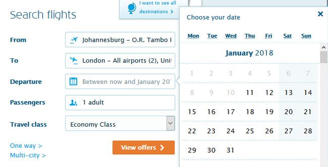
A date picker from KLM with dates in the past greyed out.
Error Messages
Clarity
Error messages must be clear and easy to understand. Don’t use error codes for your messages. They mean nothing to the user and can only create more anxiety and frustration as they aren’t able to figure out what went wrong.
Use normal, everyday language to explain what went wrong. Keep it simple and provide clear ways for the user to correct the error. Don’t be vague in your error message. Explain why something happened and how to fix it. It’s vital to tell the user what the follow-up action should be, even if it’s just to return to the previous page or the home page.
If it aligns with your brand and isn’t a serious error, you can try alleviate the stress of the situation by using some friendly humour - but be wary of doing this when the user is stressed as it might seem uncaring.
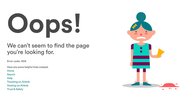
A 404 error message from Airbnb
Time
It’s best to provide feedback on errors as soon as possible. If feedback comes too late, users might get frustrated. Have you ever filled in a long form, clicked submit then got an error for one field, but find other fields, like the password field, need to be re-entered again? This should be avoided.
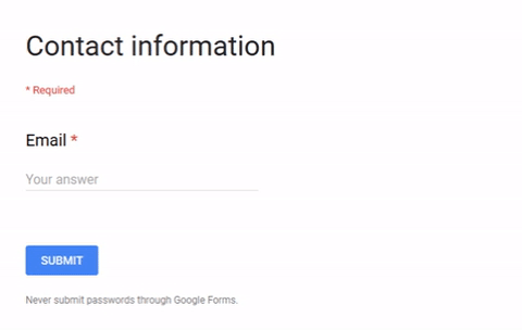
Once an error has been found, let the user know at the moment after they’ve finished interacting. Just don’t alert them too early otherwise it can get frustrating. In the example below, Google Forms alerts users that their email address is not correct before they’ve even finished typing it. This causes the user to slow down and check if they haven’t made a real mistake, but once they’ve realised they haven’t made an error it feels like they’re being punished for nothing.
Position
Errors messages need to be as clear and accurate as possible and so should be placed as close to where the error occurred as possible. Dialog boxes can sometimes cause more confusion than simple placing the error message on the page next to the problem area.
Color and Sound
Color is a clear and easy way to identify that something went wrong. Red is generally used for an error, orange for a potential problem, and green for correct.
You can also use sound to show errors and these are popularly used on operating systems with nice, positive sounds to indicate something is correct, and sharp, negative sounds to indicate a problem.
For both color and sound, it’s important to think about accessibility and factor this into your warning signs.
Activities
📖 READ
📖 READ
From About Face: The Essentials of Interaction Design Paperback, 2014, by Alan Cooper et.al.
- Chapter 15: ‘Preventing Errors and Informing Decisions’ (1h)
Lesson Task
Brief
Update contact forms on your cross-course project to use JavaScript form validation. Ensure the feedback is clear and helpful for users to spot issues on the forms they’re submitting. Users should be able to see exactly where on the form they’ve made the errors and what needs to be fixed. For example, if the email address is incorrectly formatted, it should clearly highlight that the issue is in the email address field.